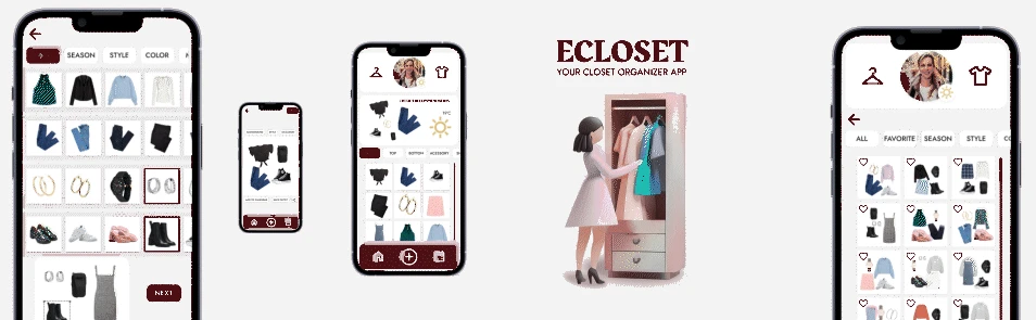
ECloset. Your Closet Organizer App
ECloset is a mobile wardrobe organization app created as a UX/UI case study, focused on simplifying daily outfit decisions, encouraging conscious consumption, and helping users better visualize the clothes they already own.
The problem
Many people struggle to organize their wardrobe, remember the pieces they own, and create outfits on a daily basis. This often leads to:
- Repeated or unnecessary purchases
- The feeling of “having nothing to wear”
- Lack of practicality in everyday routines
Sources: fabricofchange.com rollingstone.com researchgate.net
Section Detail
Beyond individual frustration, this behavior mirrors a much broader cultural and environmental issue: the overconsumption of fashion and its impact on sustainability. The fashion industry is one of the most resource-intensive consumer sectors, and it has been identified as a major contributor to environmental degradation due to production volume, waste, and short product lifecycles. (Rolling Stone Culture Council)
Academic research on fashion consumption highlights how people often own far more garments than they actually need, driven not by necessity but by habits, trend cycles, and impulse buying. Studies on minimalist fashion challenges — where participants voluntarily limit the size of their wardrobe — show that reducing clothing consumption encourages individuals to rethink their relationship with clothing, helping them distinguish between “needs” and “wants.” These practices not only reduce waste but can also enhance individual wellbeing and satisfaction by shifting the focus from quantity to quality and personal value. (ResearchGate)
The growing interest in minimalist fashion reflects a broader movement toward intentional and conscious consumption. As discussed in Minimalism in Fashion: An Answer to Overconsumption, adopting a minimalist approach helps consumers slow down their purchasing behavior, prioritize versatility and longevity, and regain control over their wardrobes. Rather than constantly acquiring new items, individuals are encouraged to curate what they already own, fostering a more meaningful, sustainable, and practical relationship with clothing. In this context, digital tools that support wardrobe awareness and organization can play a key role in enabling mindful consumption and reducing fashion overconsumption. (Fabric of Change)
🎯 Core problem: How can we make wardrobe organization simpler, more visual, and more accessible through technology while also supporting a shift toward more conscious fashion consumption?
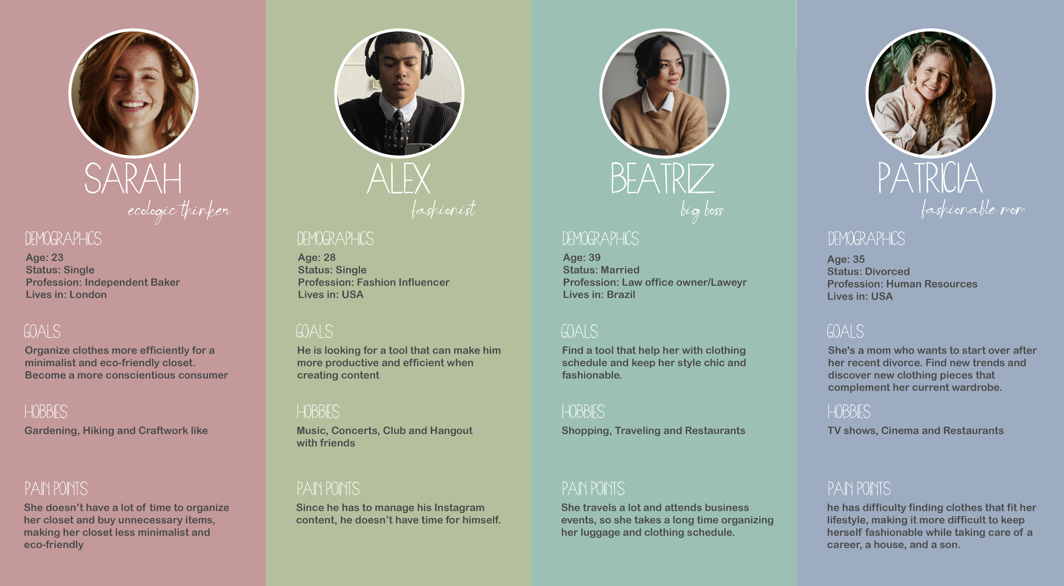
User Personas
The target users for this project are people looking for a practical and conscious way to organize and use their wardrobe. This includes:
- Users who enjoy visual planning
- People interested in functional and intentional fashion
- Users who want to reduce impulse buying and make better use of what they already own
Section Detail
Research Approach
To better understand user needs and behaviors, the research for this project was based on Competitor analysis of similar wardrobe and closet organization apps and App Store review evaluation, focusing on real user feedback and recurring patterns.
Main pain points identified:
- Users who enjoy visual planning
- People interested in functional and intentional fashion
- Users who want to reduce impulse buying and make better use of what they already own
Most valued aspects by users:
- Clean and minimal interfaces
- Easy and visual access to clothing items
- Automatic outfit suggestions that save time and reduce decision fatigue
Process & design decisions
Existing wardrobe and fashion-related apps were analyzed to identify common patterns, recurring usability issues, and opportunities for improvement within the market.
This research went beyond surface-level feature comparison. By evaluating both app structures and user flows, as well as App Store reviews, it was possible to understand which features users truly value — and which ones create friction or frustration.
Section Detail
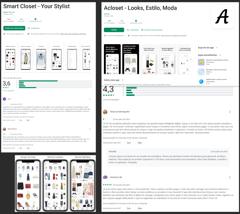
Insights gathered from competitor analysis directly informed key design decisions, such as:
- Simplifying navigation and reducing cognitive load
- Prioritizing visual organization over text-heavy interactions
- Introducing features that promote meaningful user interaction and empower users through customization
- Designing personalization features that feel intuitive rather than complex
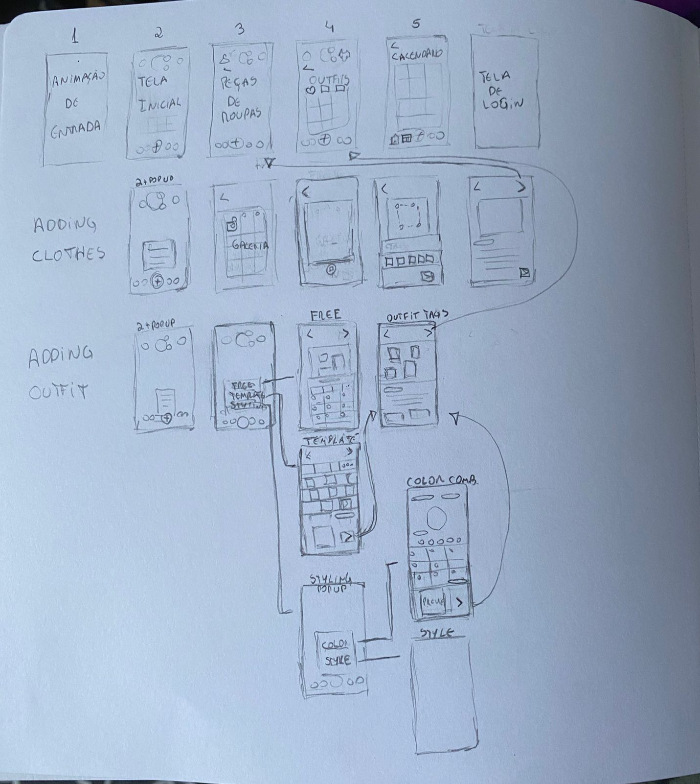
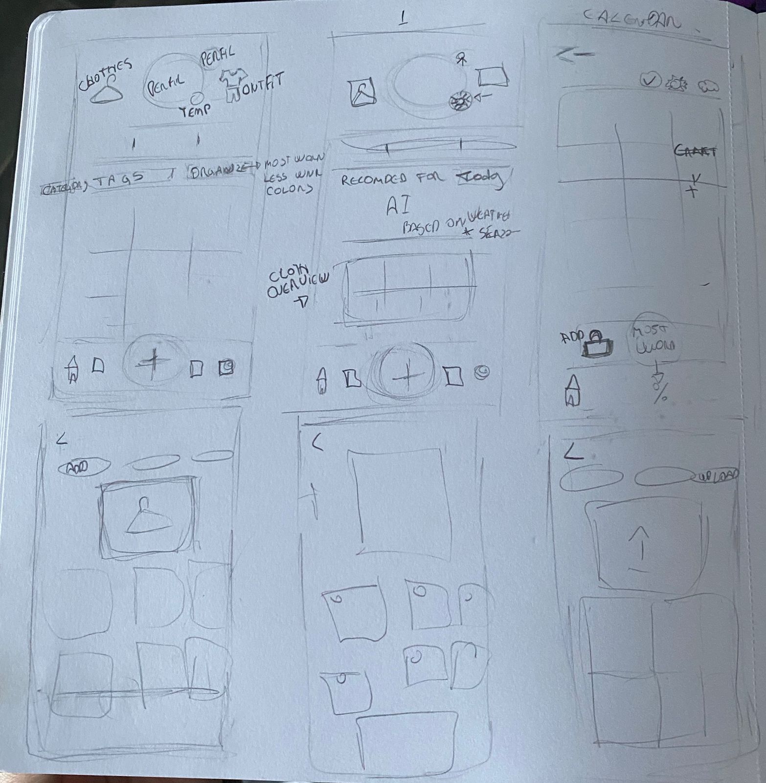
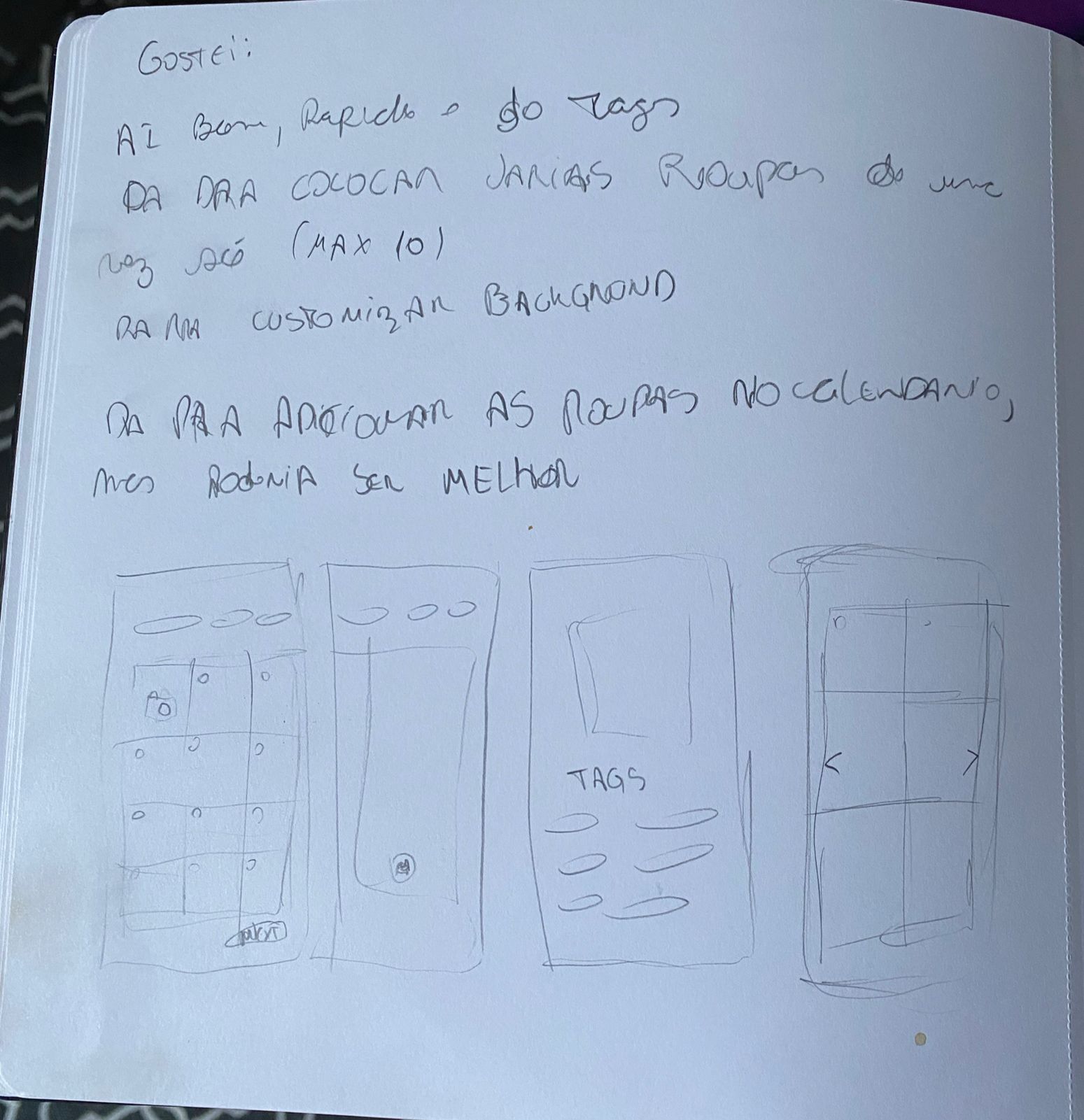
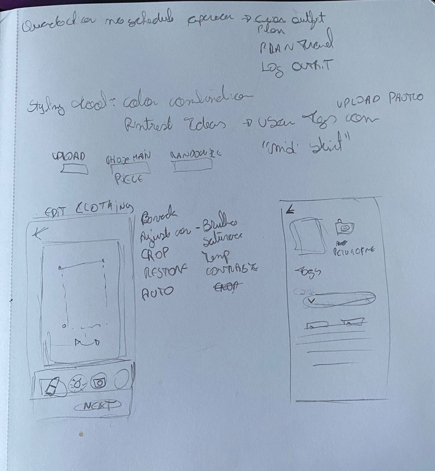
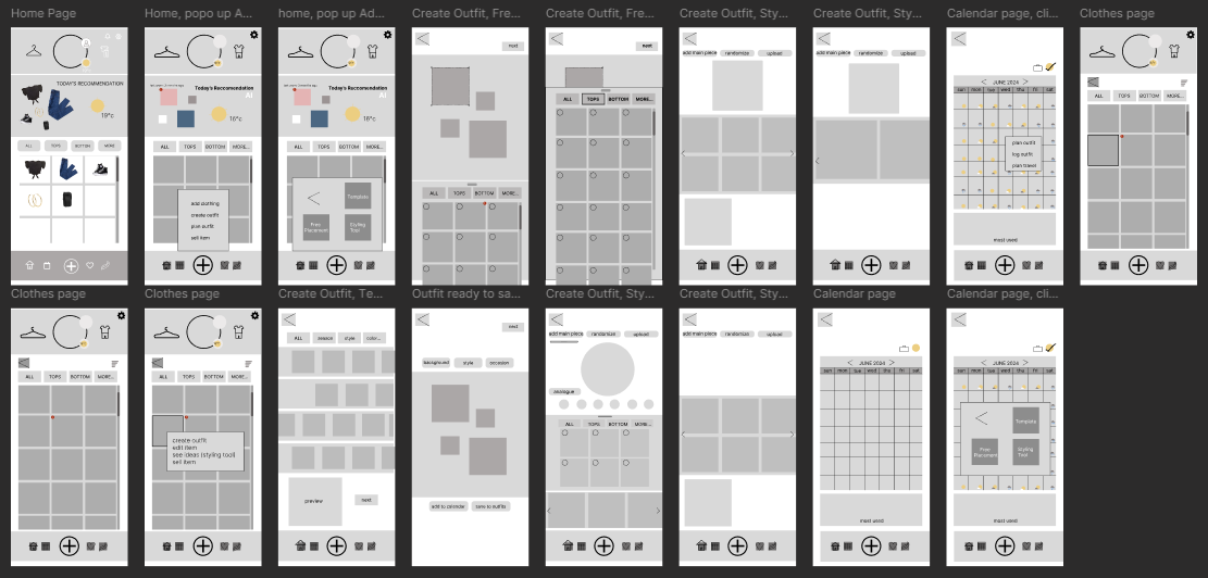
User reviews played a crucial role in highlighting what users enjoy, struggle with, and expect from a wardrobe organization app. These findings helped shape a solution that not only fills gaps left by existing products, but also improves the overall user experience by aligning functionality with real user needs.
Design system
The first version of the app (2026) had no components, hardcoded colors and inconsistent spacing. In October 2026 I rebuilt it as a design system, taking token layers from Material 3, component documentation from IBM Carbon and content guidelines from Shopify Polaris.
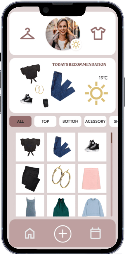
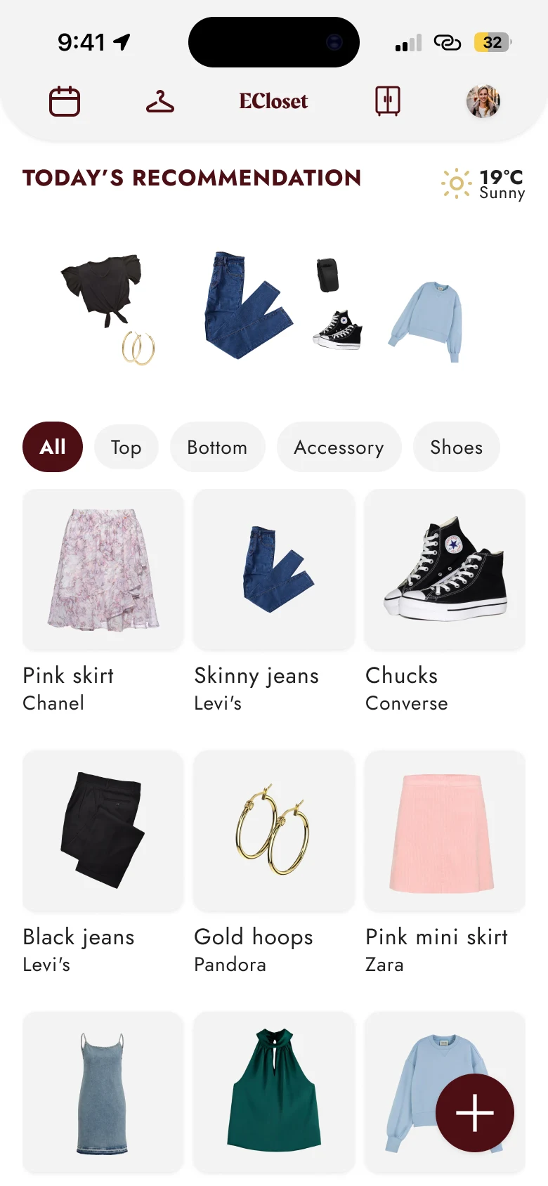
- 15:1contrast for white on the new dark red, up from about 4.4:1 on mauve, which failed WCAG AA
- 11components, all with auto layout, variants and usage descriptions
- 1typeface, Jost, with every text linked to one of 10 text styles
Foundations
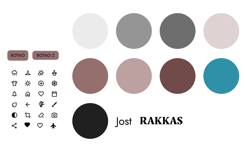
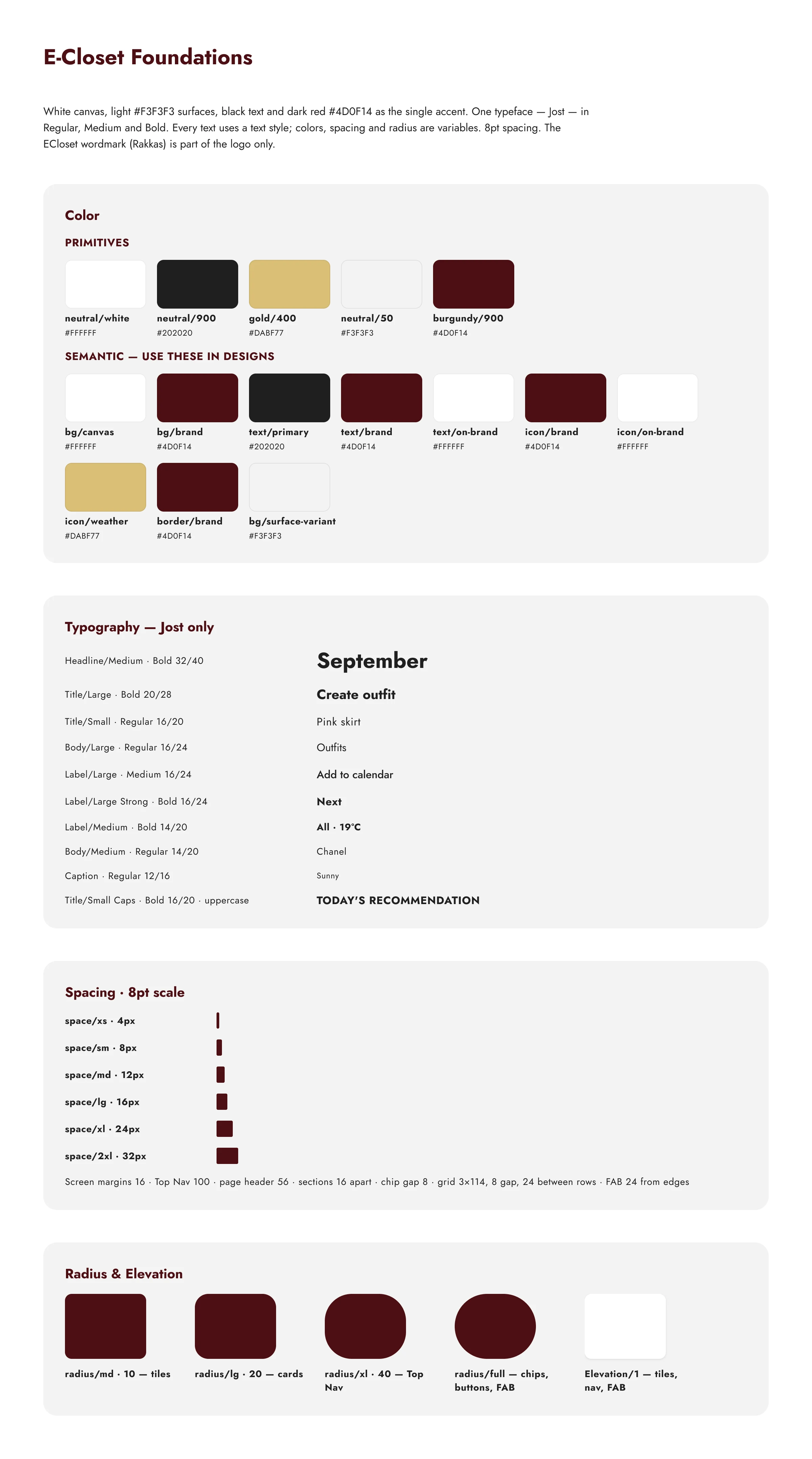
A clean white, light gray and black palette, with dark red as the single accent. Gold appears only for the weather.
- #FFFFFFbg/canvas
- #F3F3F3bg/surface-variant
- #202020text/primary
- #4D0F14bg/brand, text/brand
- #DABF77icon/weather
- Tokens in two layers: primitives (neutral/900, burgundy/900…) feed semantic variables (bg/brand, text/primary, icon/brand, border/brand…), and designs use only the semantic ones.
- Type: Jost Regular, Medium and Bold in 10 styles, from Caption 12 to Headline 32. The Rakkas "ECloset" wordmark is the only exception, because it's the logo.
- Spacing and shape: an 8pt scale from 4 to 32, radius tokens of 10, 20, 40 and full, and one elevation style.
- Layout: 16px screen margins and 16px between sections, a 3-column item grid of 114px tiles with 8px gaps, and the FAB 24px from the edges.
Foundations board
Components
Every screen is built from the same 11 components:
- Button
- Chip
- Tag
- Icon Button
- Item Tile
- Category Tabs
- Top Nav
- Top App Bar
- FAB
- Favorite
- Icons (12)
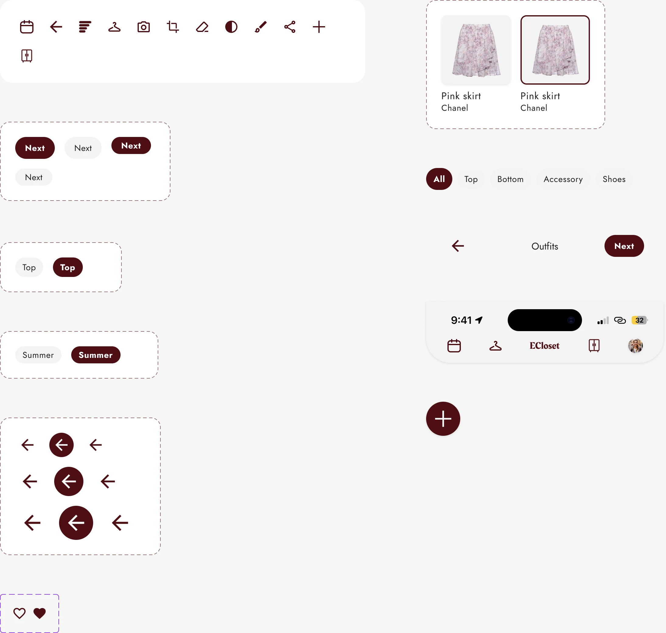
Icon buttons keep a 40px tap area, and no text is smaller than 12px. I also removed every unused page, component, icon, variable and style, so the file only contains what the product uses.
Final Solution
ECloset delivers a visual and intelligent solution for personal wardrobe organization, designed to simplify daily outfit decisions while encouraging more conscious fashion habits.
Based on insights gathered from competitor analysis and user reviews, the app focuses on usability, personalization, and meaningful interaction, addressing common frustrations such as complex interfaces, lack of customization, and poor visual organization.
Key features:
- Visual Wardrobe Management
- AI-Powered Item Registration
- Smart Tags and Filters
- Weather-Based Outfit Recommendations
- Outfit Planning Calendar
- Usage Insights and Clothing Rotation
Section Detail
Visual Wardrobe Management
Users can easily register and visualize their clothing items in a clean, image-based interface. The focus on visual clarity reduces cognitive load and makes wardrobe navigation intuitive.
AI-Powered Item Registration
To reduce friction during onboarding and item registration, ECloset uses artificial intelligence to automatically remove image backgrounds and assist in identifying clothing types. A built-in editing tool allows users to adjust images before saving, ensuring consistency and visual quality across the wardrobe.
Smart Tags and Filters
Clothing items can be categorized using customizable tags such as summer, winter, casual, or formal. Filters help users quickly find pieces based on season, style, or personal criteria, addressing the need for faster access and better organization.
Weather-Based Outfit Recommendations
Outfit suggestions are generated based on current or forecasted temperature, helping users choose appropriate looks while making better use of existing items.
Outfit Planning Calendar
A weekly calendar allows users to plan outfits in advance, reducing decision fatigue and saving time in daily routines. Users can also add contextual tags such as event or travel, enabling more specific and intentional planning.
Usage Insights and Clothing Rotation
ECloset tracks how often each item is used and displays usage percentages. This feature helps users identify underused pieces, encouraging wardrobe rotation, mindful consumption, and more informed purchasing decisions.
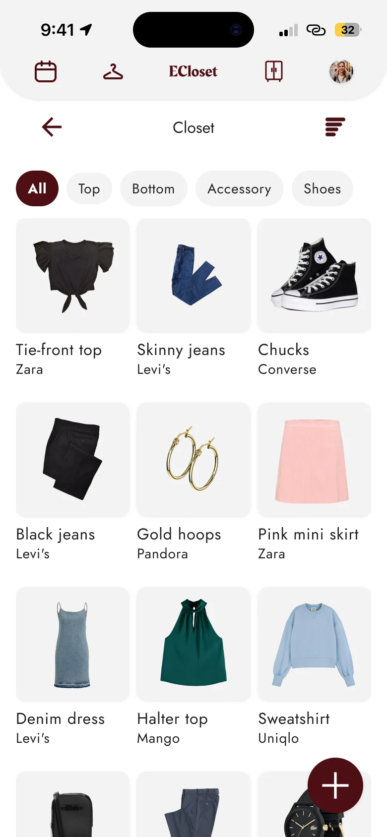

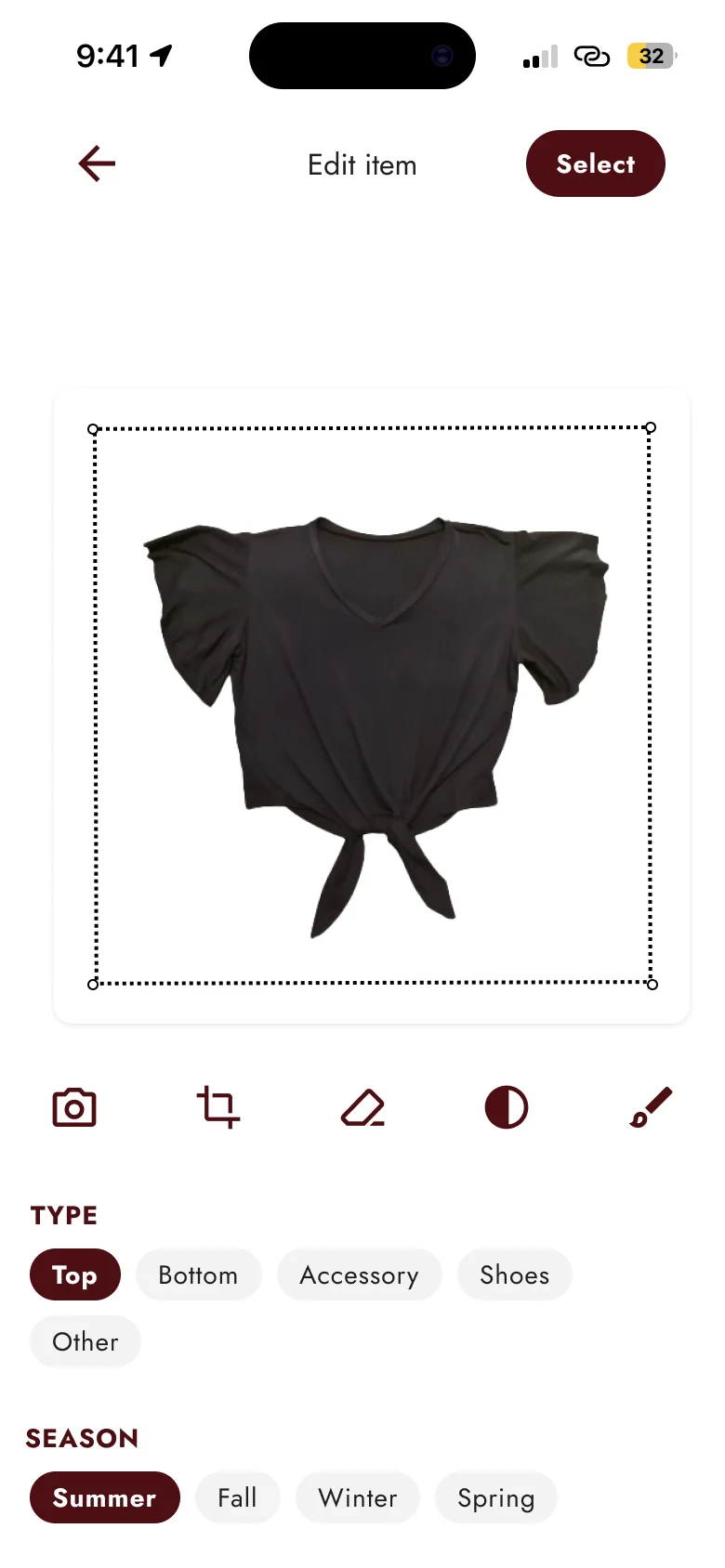
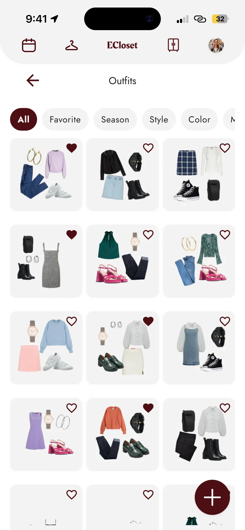
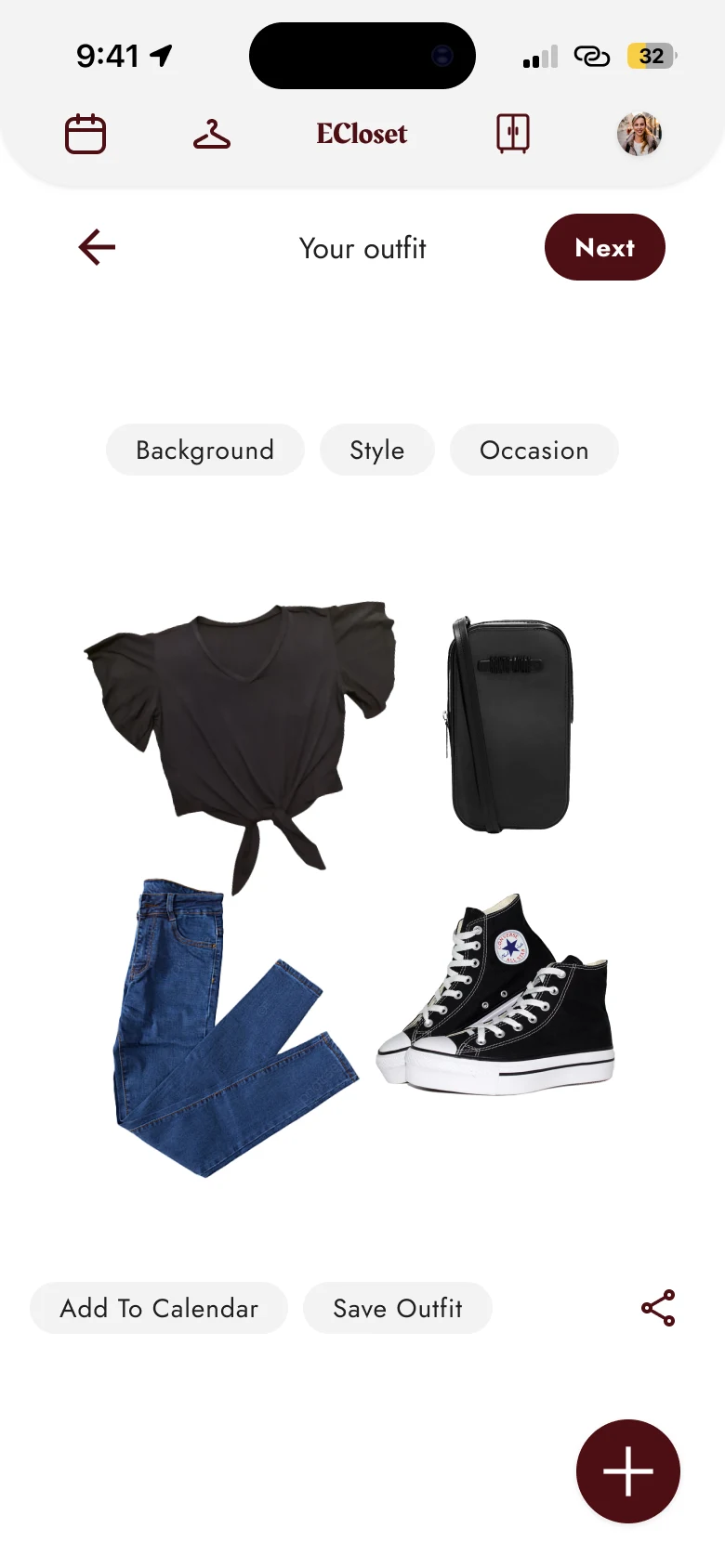
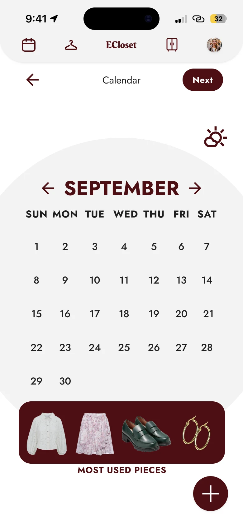
Design Impact: By combining visual organization, smart recommendations, and user-controlled customization, ECloset transforms wardrobe management into an enjoyable and practical experience. The solution not only reduces friction in daily outfit planning but also supports more sustainable and conscious fashion behaviors.
Learnings
This project reinforced the importance of grounding design decisions in real user insights. Analyzing app store reviews proved to be a valuable research method, revealing recurring pain points, unmet needs, and expectations that are often overlooked in surface-level analysis.
A deeper study and development of user personas was essential to translate these insights into actionable design strategies. By synthesizing behaviors, goals, and frustrations observed in users of competing wardrobe organization apps, the personas helped maintain a clear user-centered focus throughout the design process.
The brainstorming phase played a key role in transforming research findings into meaningful features. Instead of adding functionality for the sake of complexity, ideas were evaluated based on how well they aligned with the product’s core purpose and supported everyday usability. This process highlighted how feature relevance is as important as feature quantity.
Additionally, understanding how existing wardrobe organization apps function in real-life scenarios provided valuable perspective on what makes such tools truly practical for daily use. Observing common interaction patterns and usability issues emphasized how small UI decisions, such as visual hierarchy, filtering logic, and interaction flow can significantly impact usability, efficiency, and user satisfaction.
Overall, this project strengthened the understanding that successful UX design emerges from the balance between research, intentional ideation, and continuous alignment with user needs.
From the redesign
- Components are easier to build first. Turning finished screens into components meant finding every slightly different copy of a button or tile and replacing it by hand. Next time I'll start with the components.
- Token layers make big changes small. Because screens use semantic variables and not raw colors, moving from mauve to dark red took a change in a few primitives, not a hunt through every frame.
- One typeface is enough. Ten Jost styles covered everything from captions to headlines, and the screens feel calmer and more consistent than with mixed fonts.