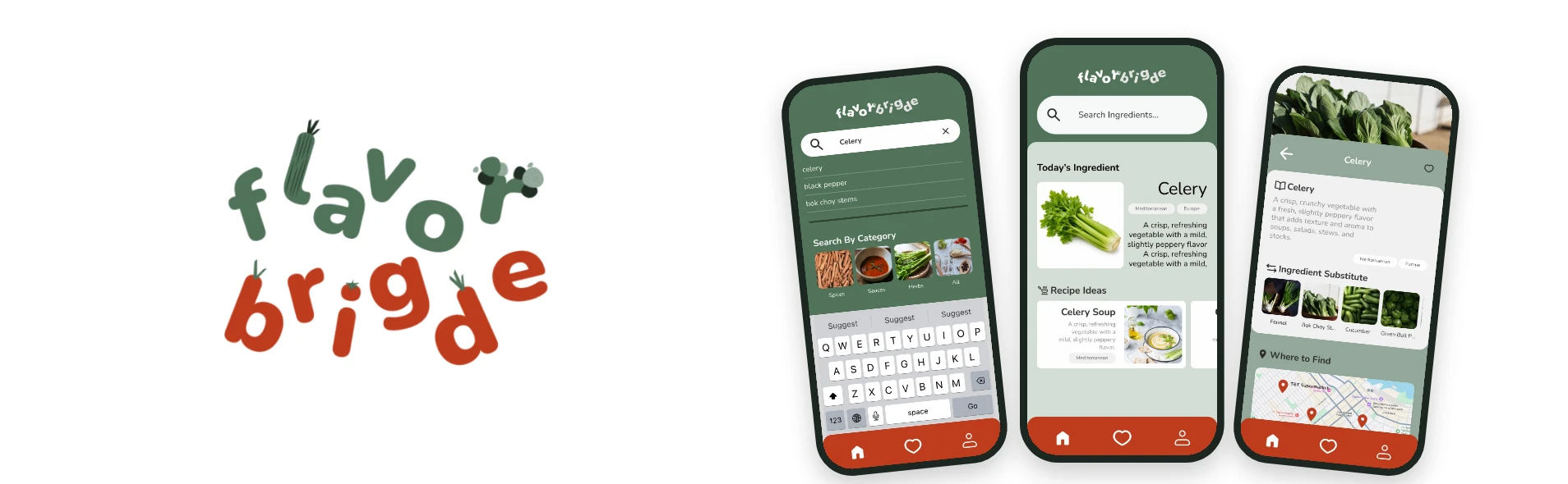
FlavorBridge. Bridging you to the flavors of home.
A mobile app that helps newcomers in Canada find specialty ingredients from home, the stores that carry them, substitutes, and recipe ideas.
The problem
Immigrants and international residents in Canada often struggle to find familiar ingredients from their home countries. They face high prices, limited availability, information scattered across many platforms, and long trips to specialty stores.
Who it's for
Newcomers, international students and immigrants in Canada who cook at home often, to save money, eat healthier and keep the taste of home. Today they piece answers together from Google Maps, ChatGPT and social media, and visit several stores to find one item.
The goal
Help users quickly discover ingredients, find nearby stores that carry them, and save their favorites.
🎯 Framing question: Are we helping international students find ingredients, or are we helping them find familiar food experiences? The answer that guided the project: helping international students discover familiar food and ingredients in a new country.
Discovery research
We started with desk research, split between the three of us and then merged into one shared summary. From there we ran 3 interviews and a 10-person survey, and grouped what we heard in an affinity map.
- 90%+of survey participants had trouble finding ingredients from their home country
- 85.7%were interested in a solution that makes ingredient discovery simpler
- 57%wanted ingredient substitute recommendations when an item is unavailable
What we asked
- Have you ever had difficulty finding ingredients from your home country?
- What do you usually do when you cannot find an ingredient? (online search with ChatGPT, Google or Google Maps; visiting multiple stores; using a substitute; ordering online; giving up on the dish)
- Which information would be most helpful when searching for familiar food? (store locations, product availability, ingredient substitutes, user recommendations, price comparison, reviews)
Define
With the problem statement in place, we ideated together and prioritized the features for a minimum viable product:
- Search
- Browse by Category
- Ingredient Detail
- Substitutes
- Where to Buy
- Recipe Ideas
- Favorites
Information Architecture
To organize the content, we explored the LATCH framework, ran card sorting and tree testing, and drafted a sitemap and user flows. These were early, exploratory steps: the structure kept evolving once we moved into wireframes and testing, so the final app differs from these first drafts.
Visual direction
Three words shaped the look and feel of the app:
Intuitive
Makes discovering combinations feel simple and natural.
Curious
Inspires users to explore unfamiliar ingredients and pairings.
Explorative
Encourages discovering unexpected flavor combinations.
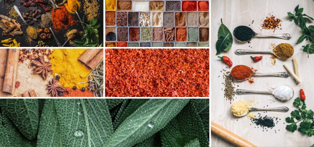
Inspired by herbs and spices, FlavorBridge's color palette celebrates freshness, authenticity, and cultural diversity. Warm earthy tones create a friendly and inviting experience while helping users discover ingredients and explore new cuisines with confidence.
- #BF3C1Ewarmth, flavor, energy
- #51735Afreshness, nature, trust
- #F5CA48discovery, optimism, attention
- #730707passion, alerts, emphasis
Design System
We built a full UI kit in Figma following atomic design: atoms (images, logo, text, inputs, tags), molecules (cards, search and filter, navigation), organisms (discovery, content cards, page content, account) and finally page templates. Everything uses one typeface, Nunito, and an 8-point spacing scale with 4px increments; we didn't use a layout grid. Every key color pair was checked against WCAG AA.
Typography, spacing and accessibility
Typography: Nunito, regular and bold
- Display / H1
- 36px, −1% letter spacing
- H2
- 20px
- Body and buttons
- 16px and 18px, 1% letter spacing
- Tags and tooltips
- 10px, 2% letter spacing
Spacing scale
- 4px
- Icon adjustments
- 8px
- Icon and text spacing
- 12px
- Chip gap
- 16px
- Card content spacing
- 24px
- Section spacing
- 32px
- Large content spacing
- 40px
- Screen margin
- 48px
- Top screen padding
- 64px
- Hero banner spacing
Accessibility
White on the page green (5.31:1), white on the navbar orange (5.41:1) and dark text on white (13.38:1) all pass WCAG AA.
Tablet layout
The screens also adapt to tablets: 563–834px wide, 1194px tall, with 40px padding on every side.
UI Design
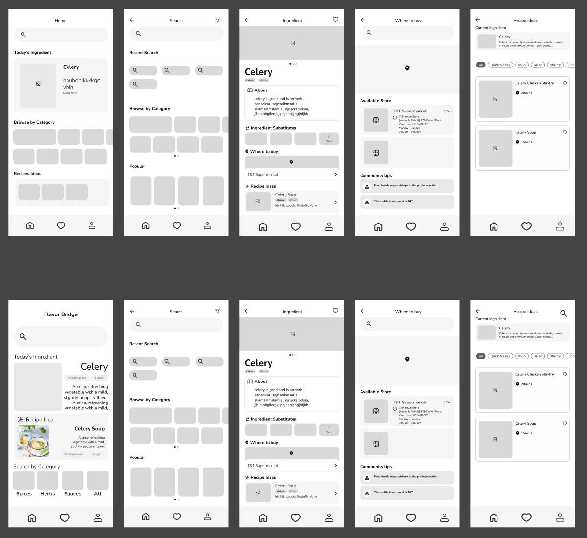
We moved from wireframes to mockups to final screens, refining the layouts at each step.
Final Designs
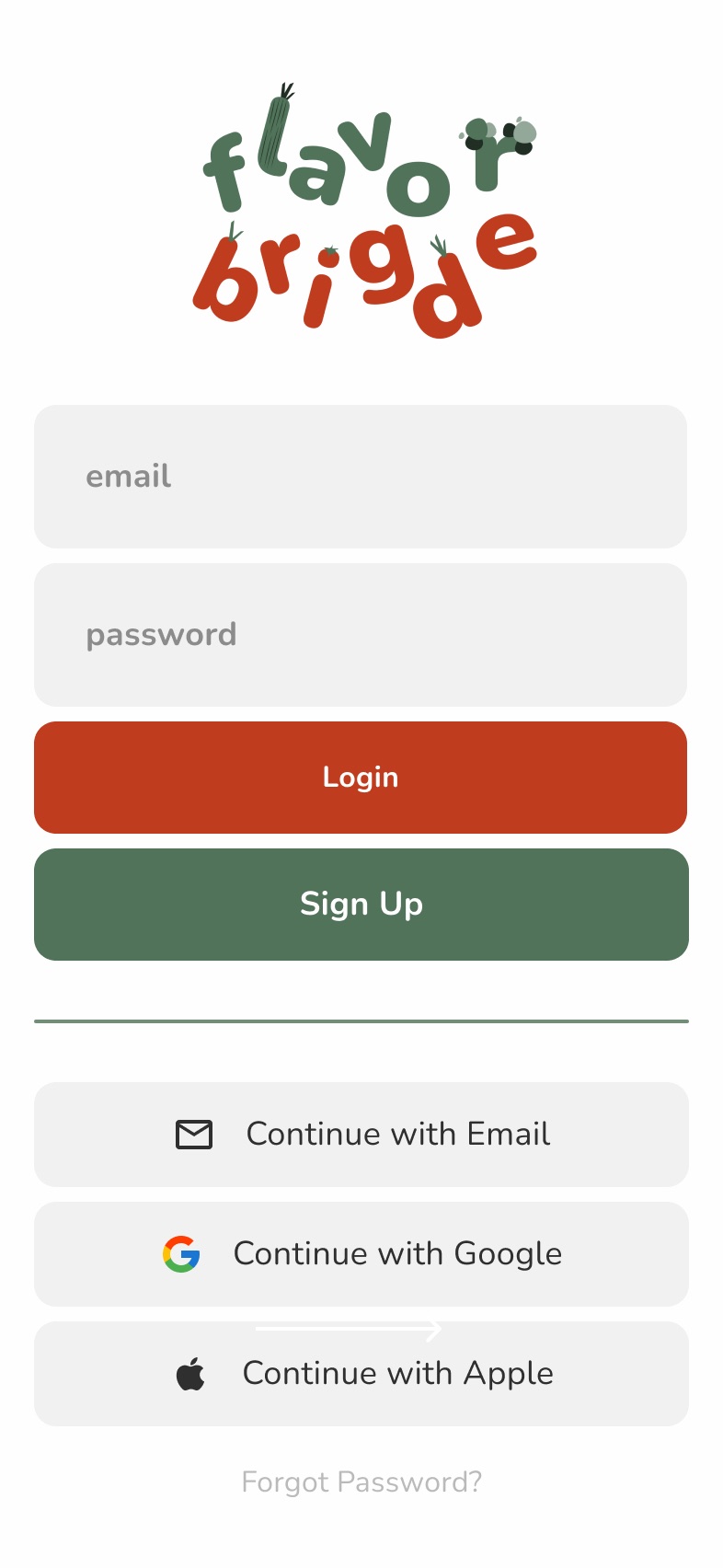
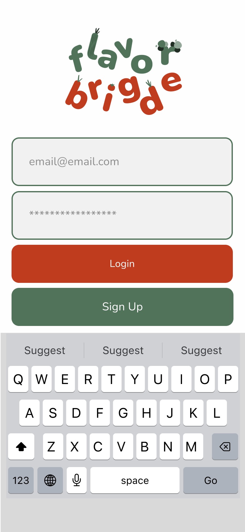
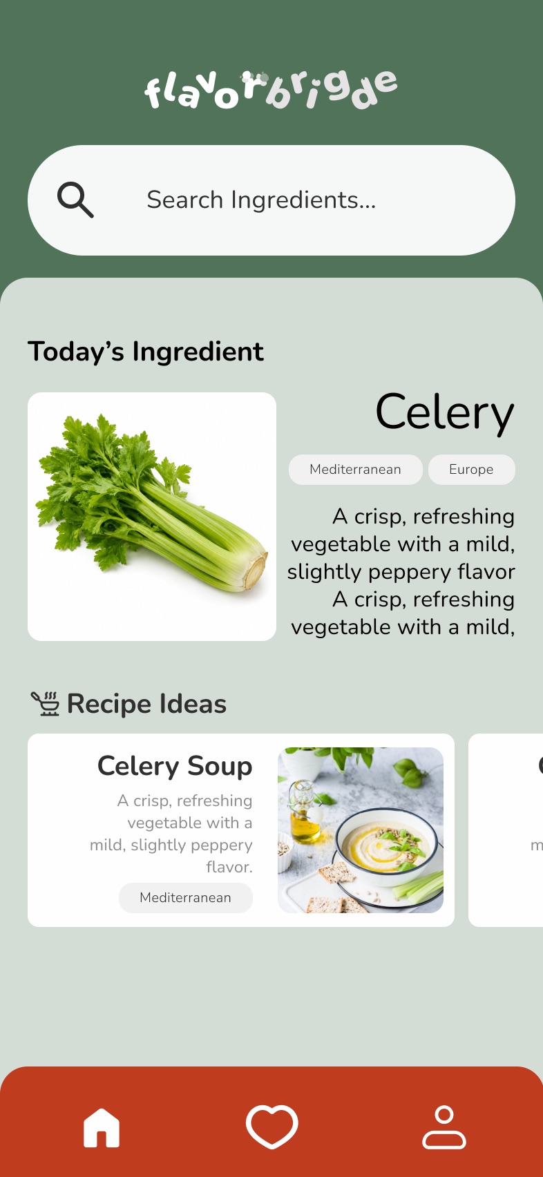
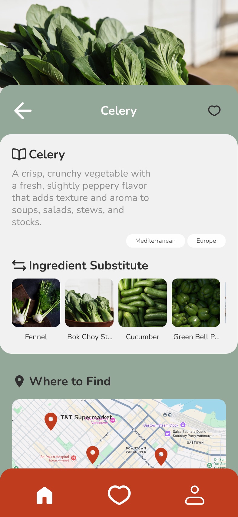
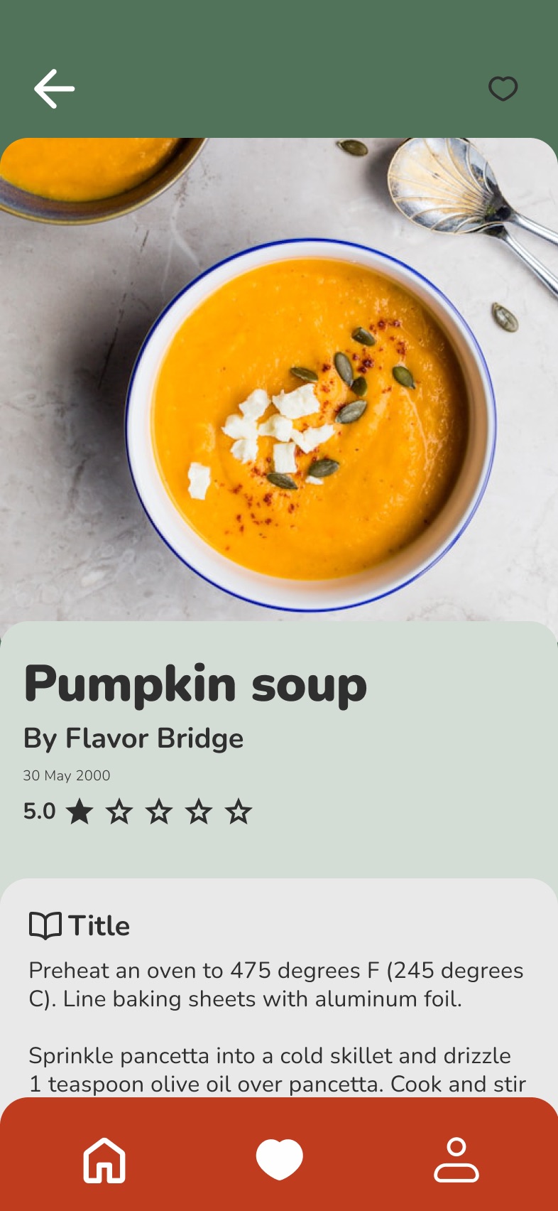
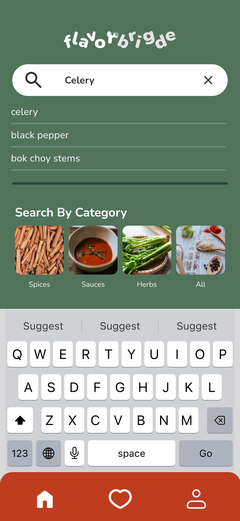
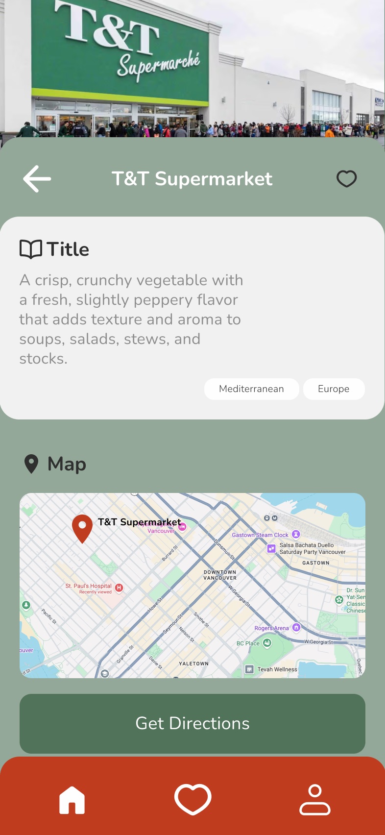
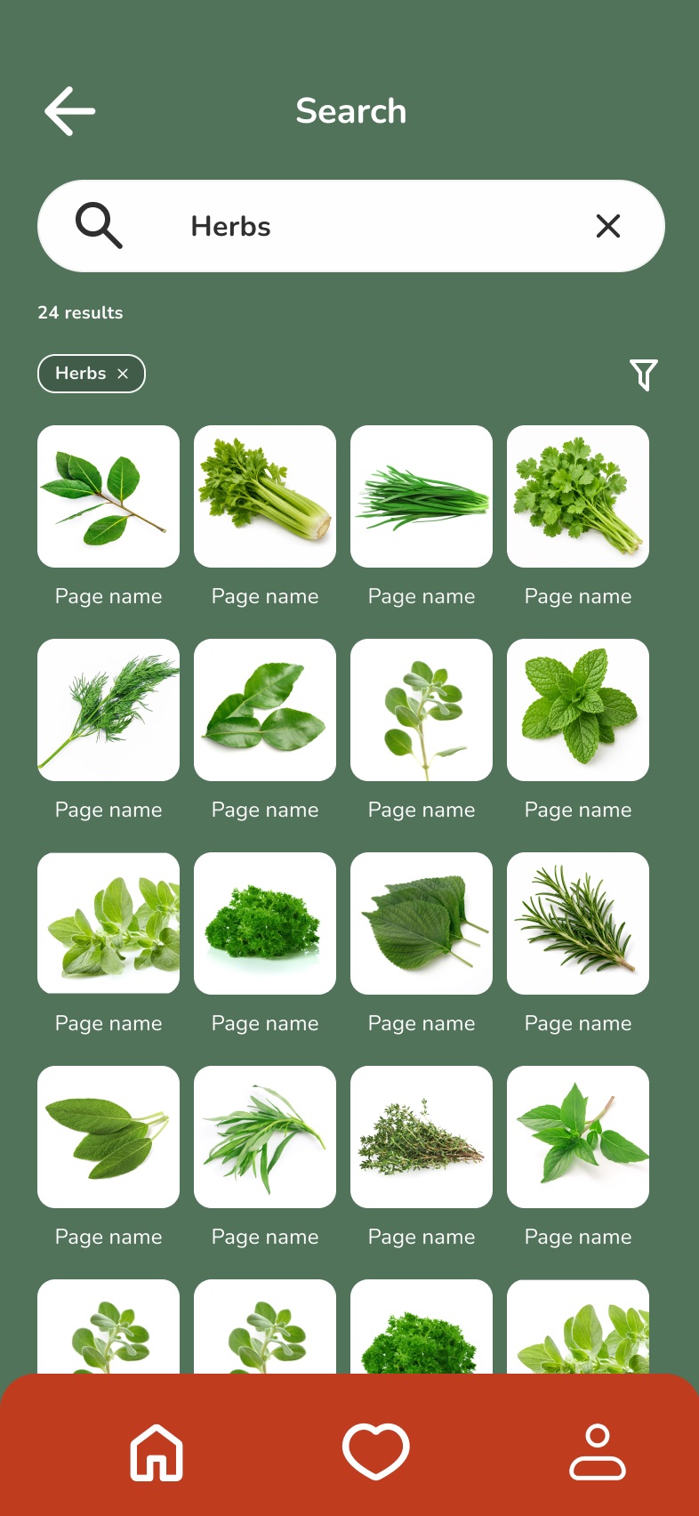
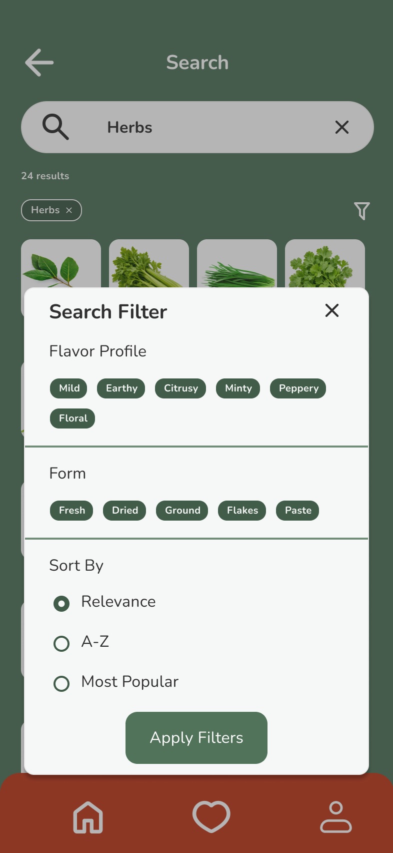
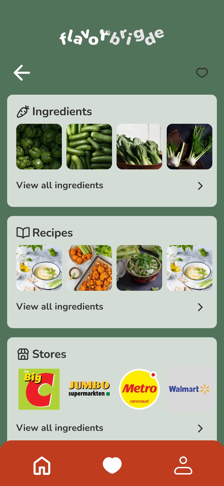
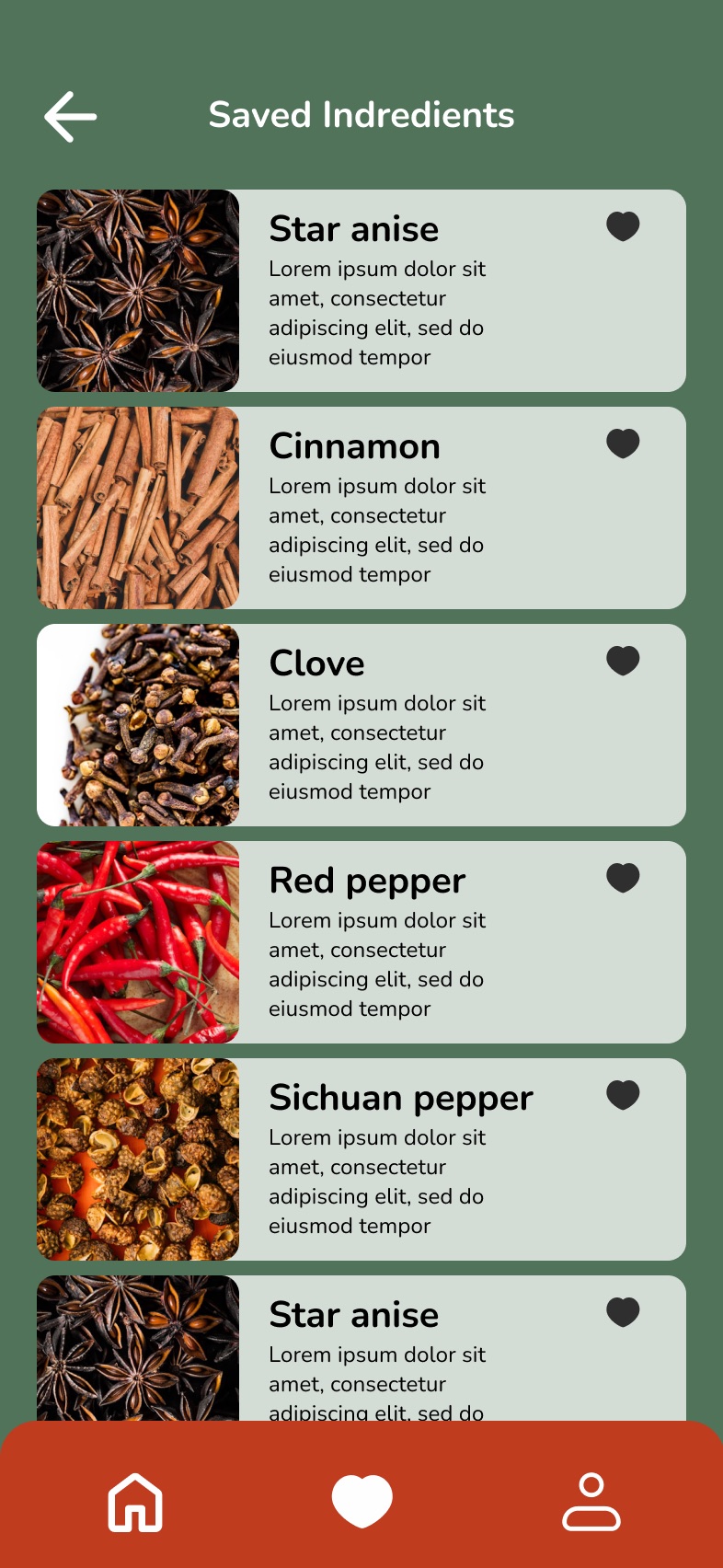
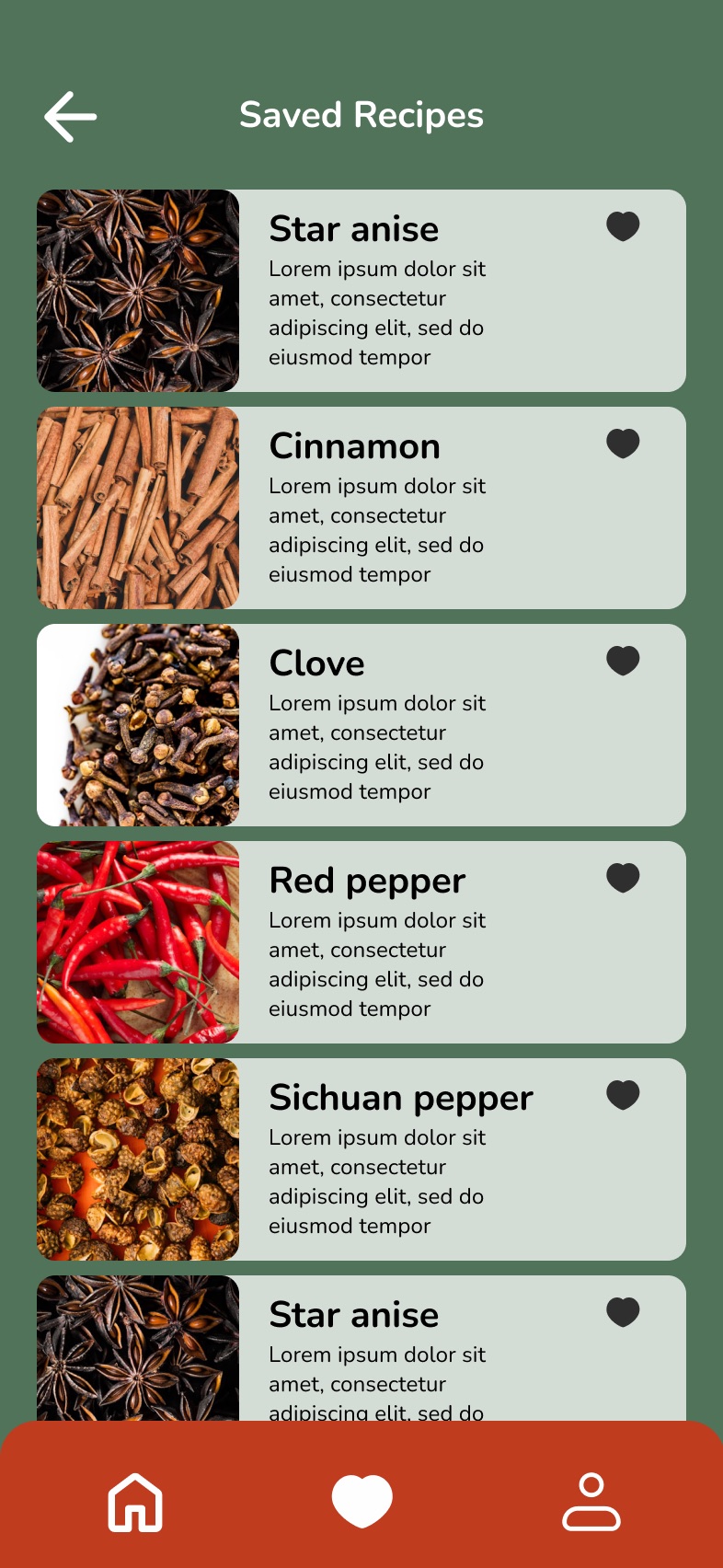
The final app covers signing in, today's ingredient, search and where to buy, browsing by category, and favorites.
Design evaluation
With the prototype built, we went back to users to see what worked. We first mapped the app against the UX honeycomb:
Useful
Get recipes, pairings and substitutions based on the ingredient.
Usable
Scan or search an ingredient and quickly know what to do with it.
Desirable
Inspire users to try new ingredients and pairings.
Findable
Search and filter ingredients, recipes and flavor pairings with ease.
Accessible
Clear information and simple interactions for all cooking skill levels.
Credible
Provide accurate ingredient, pairing and substitution information.
Valuable
Turn ingredients into new ideas, and make unfamiliar ingredients work for you.
Two questions to answer
- How might we make FlavorBridge easier to understand and use for first-time users?
- How might we increase user engagement and encourage users to use the app more often?
Three methods, one per team member
Survey · Mo
What do users value? First-time usability, ingredient discovery, personalization and engagement.
Interviews · Jou
Why do users behave this way? First-time usability, information seeking, ingredient needs and engagement.
Usability test · Evelin
Can users actually use it? First-click behavior, task completion, navigation and interaction.
What users told us
Survey: four findings
- 66.7%Clarity over instructions. Rated understanding a new app without help as important. Users need a clear interface, not more tutorials.
- 83.3%Lookups are rare. Rarely look up unfamiliar ingredients, so an ingredient finder alone won't bring people back.
- 66.7%Inspiration, not just information. Value discovering new ingredients that match their tastes.
- 100%Personalization, in context. Showed moderate to high interest in recommendations based on what they like and what they have.
The shift: from "What is this?" to "What can I do with this?" Turn ingredient discovery into personalized food inspiration.
All 10 survey questions
- When you use an unfamiliar app for the first time, how important is it for you to understand what to do without needing help?
- When you first open an unfamiliar app, what do you usually do first?
- What helps you understand how to use a new app when using it for the first time?
- When you don't know how to find something in an app, what do you usually do?
- How often do you look for information about unfamiliar ingredients?
- What would make you more likely to use an ingredient finder app regularly?
- How interested would you be in personal recommendations based on your preferences?
- Which type of personal recommendations would be most useful to you?
- How important is it for you to discover new ingredients that match your tastes?
- In which situations would you be most likely to use this app as an ingredient finder?
Interviews: four mental models
Across 6 interviews, our questions moved from broad ("How did you figure out what to do in a new app?") to focused ("What information do you want to know about an unfamiliar ingredient?"). Four expectations kept coming up:
Familiarity
"I expect new apps to work like apps I already know."
Actionable value
"Don't just tell me what it is."
Findability
"If I can't find it, I'll search elsewhere."
Recurring value
"I'll come back if the app stays useful."
Our assumptions were challenged
| Before research | What we learned |
|---|---|
| More instructions = easier onboarding | Not necessarily. Users often prefer exploring on their own if the interface is clear. |
| More features = more engagement | Not necessarily. Users value simplicity and usefulness. |
| Ingredient identification = the main value | Incomplete. Users want actionable information and inspiration. |
| Personalization = better engagement | Context matters. Recommendations should feel relevant and trustworthy. |
More features do not automatically create more value.
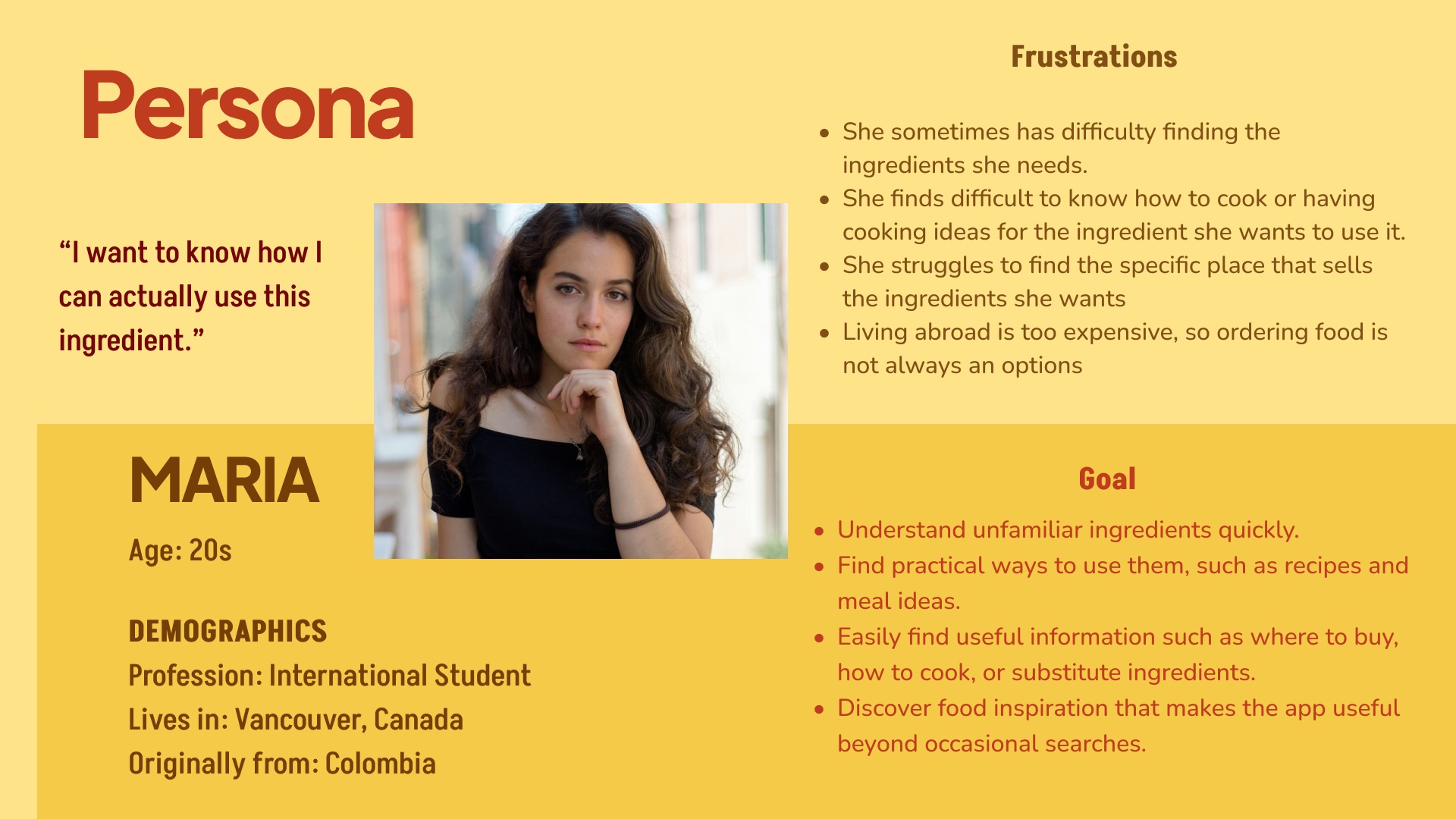
Persona: Maria
An international student in her 20s, originally from Colombia and living in Vancouver. "I want to know how I can actually use this ingredient." She struggles to find the ingredients and the stores that sell them, isn't sure how to cook them, and can't always afford to order food. She wants to understand unfamiliar ingredients quickly, find recipes, where to buy and substitutes, and get food inspiration that makes the app useful beyond occasional searches.
Usability testing
I led the usability tests on UXtweak with 5 participants: a first-click test with 6 tasks (search for an ingredient, favorite it, check Today's Ingredient, open Account settings, go to Favorites, change the password) and a prototype test with 4 longer tasks (find where to buy Today's Ingredient, find the store details and directions, delete the account, check favorite recipes).
- 100%of first-click tasks were completed by every participant
- 96.7%average first-click success (4 participants at 100%, one at 83.3%)
- 60%overall success in the prototype test, so the multi-step flows needed work
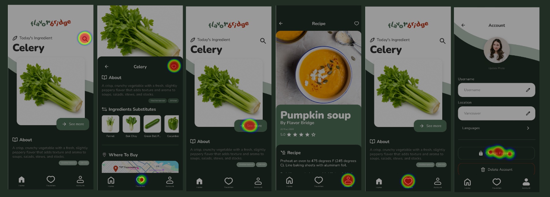
What slowed people down
- Too many steps to find a store.
- People wanted more options on maps.
- "See more" looked like it would show more images, not where to buy.
Iterating on the design
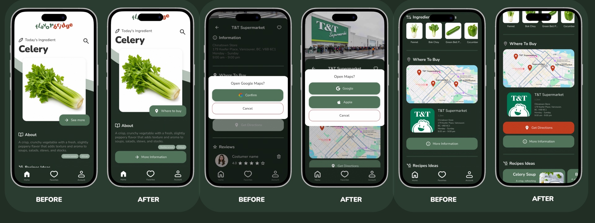
We fixed each problem the tests surfaced:
- Clearer next step: "See more" became a Where to buy button, with a separate More Information button.
- More map options: "Get directions" now lets people choose Google Maps or Apple Maps.
- Fewer steps to a store: the Where to Buy section shows the map and the store card together, with Get Directions right there.
- 88.5/100System Usability Scale score, well above the 68 average
- 4.8/5highest-rated positive answer. People described it as easy and confident to use, with low complexity
- 1.0/5lowest scores on three of the five negative statements