Miniloop - Buy and Sell Kids’ Clothes
Miniloop is a cross-platform solution (app and website) designed to facilitate the buying and selling of second-hand kids' clothing. By focusing on the "quick turnover" nature of children's wardrobes, Miniloop aims to create a sustainable, circular economy for parents.
🎯 Core problem:
How can we empower parents to easily declutter and sell outgrown kids' clothing by providing intuitive tools to communicate accurate sizing and quality, ensuring the process is efficient, rewarding, and sustainable?
Section Detail
Strategic Focus
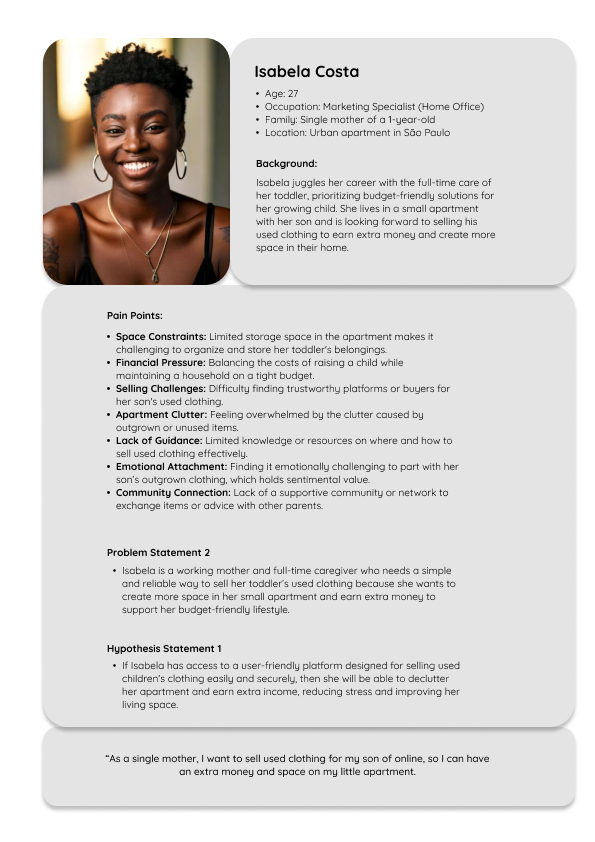
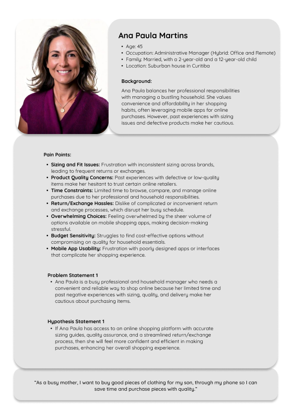
To understand the full ecosystem of the kids' clothing resale market, my initial research and Empathy Phase included both buyers and sellers. However, to provide a high-impact solution for the 'quick turnover' nature of kids’ clothes, I decided to focus the Prototype Phase exclusively on the Seller Experience. By solving the friction points for parents like Isabela, such as apartment clutter and complex listing processes.
The Goal
To build a trustworthy marketplace that simplifies the listing process for sellers and provides buyers with accurate sizing data and honest descriptions.
Empathize
To kick off my user-centered design process, I conducted three semi-structured interviews with potential users to understand the realities of managing a child’s wardrobe.
Research Synthesis: Empathy Mapping. To organize the qualitative data gathered, I created an Empathy Map (categorized by what users Say, Think, Do, and Feel). This technique allowed me to move beyond surface-level comments and uncover deep-seated frustrations.
Section Detail
User Stories: Based on these insights, I defined the core needs for the Miniloop seller experience:
- Efficiency: As a busy parent, I want to list outgrown clothes quickly, so that I can declutter my home without wasting precious time.
- Trust: As a seller, I want to provide honest and clear sizing observations, so that I can build a reliable reputation and avoid buyer disputes.
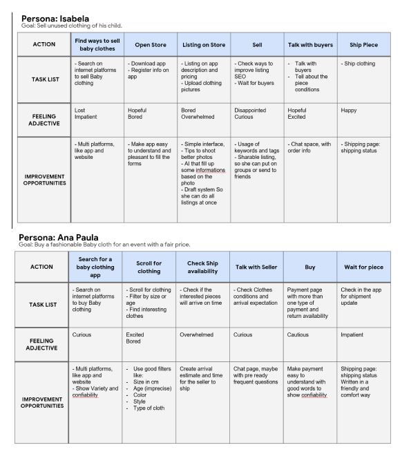
User Journey Mapping is a vital UX methodology used to visualize the end-to-end experience of a user as they interact with a product. By tracking a user's actions, goals, and emotional states across various stages, I can empathize with their needs, pinpoint exactly where they encounter friction, and identify strategic opportunities for design intervention.
For this project, I mapped the journey of Isabela, a mother whose goal is to sell her child's unused clothing efficiently. This visualization allowed me to identify critical moments where sellers felt "lost" or "overwhelmed"—particularly during the initial search for a platform and the complex listing process. These insights were essential in developing targeted solutions, such as AI-assisted product descriptions and a simplified listing draft system, to transform a frustrating process into a seamless experience.
Personas: Based on the research insights and patterns identified during the interview phase, I developed user personas to represent our primary sellers. These personas encapsulate the most common behaviors, goals, and frustrations of parents managing the "quick turnover" of a child's wardrobe. By humanizing the data, these personas served as a strategic guide for all design decisions, ensuring that every feature addressed a real user need.
Define
User Problem Statement
Based on the patterns identified in my research, I defined the core challenge for our primary seller persona, Isabela:
“Isabela is a working mother and full-time caregiver who needs a simple and reliable way to sell her toddler’s used clothing because she wants to create more space in her small apartment and earn extra money to support her budget-friendly lifestyle.”
Section Detail
Hypothesis Statement
To guide the upcoming ideation and prototyping phases, I formulated a hypothesis to test our proposed solution:
“If Isabela has access to a user-friendly platform designed for selling used children’s clothing easily and securely, then she will be able to declutter her apartment and earn extra income, reducing stress and improving her living space.”
User Quote
“As a single mother, I want to sell used clothing for my son online, so I can have extra money and space in my little apartment.”
Ideate
In the Ideation phase, the goal was to transition from the defined problem into a range of creative and functional design possibilities. This stage involved a brief competitive research and divergent thinking to ensure the final product was both innovative and grounded in market standards.
Section Detail
Competitive audit
I conducted a brief audit of industry leaders Etsy and Mercado Livre to identify essential features for a successful marketplace.
Strategic Insight: I observed that both competitors prioritize direct communication through messaging to build trust. This led me to include a dedicated "Chat Space" in Miniloop, ensuring sellers can easily clarify item conditions and negotiate directly with buyers.
Rapid Sketching: Crazy Eights
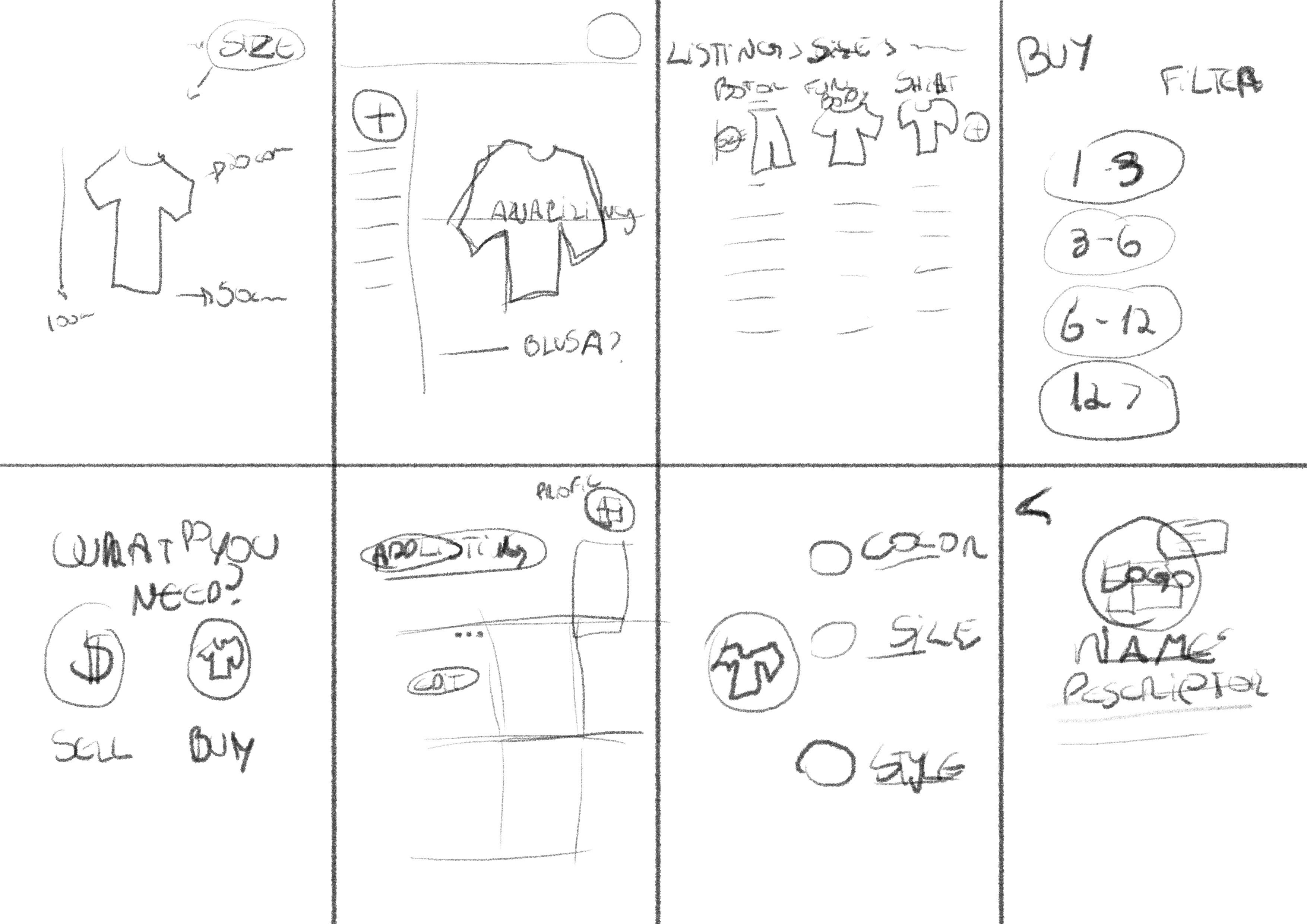
Using the Crazy Eights method, I generated eight distinct UI concepts in a short timeframe to challenge my initial assumptions.
The Focus: These sketches explored intuitive ways for sellers to handle photo uploads and sizing filters, ensuring the listing process is as fast and visual as possible to accommodate a parent’s busy schedule.
Categorized Ideation Board
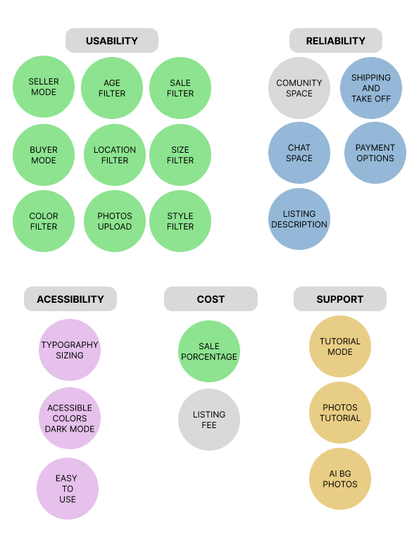
To organize these ideas into a clear product strategy, I developed an Ideation Board across five key categories. While not all of these features were included in the initial prototype, this board serves as a strategic roadmap, identifying the high-potential features planned for future updates to the Miniloop ecosystem:
- Reliability: Inclusion of the "Chat Space" and clear Payment Options to foster user confidence.
- Support: Tools like "Tutorial Mode" and "AI BG Photos" to help sellers create professional listings with zero extra effort.
- Accessibility: Prioritizing an "Easy to Use" interface with accessible colors and typography.
- Cost: Establishing a clear "Sale Percentage" to help Isabela reach her goal of earning extra income.
IA and Wireframes
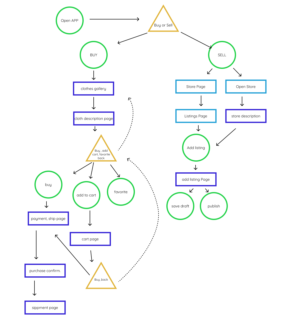
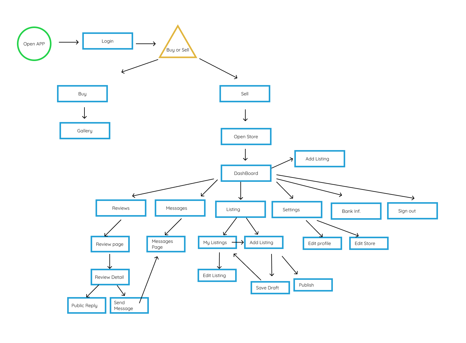
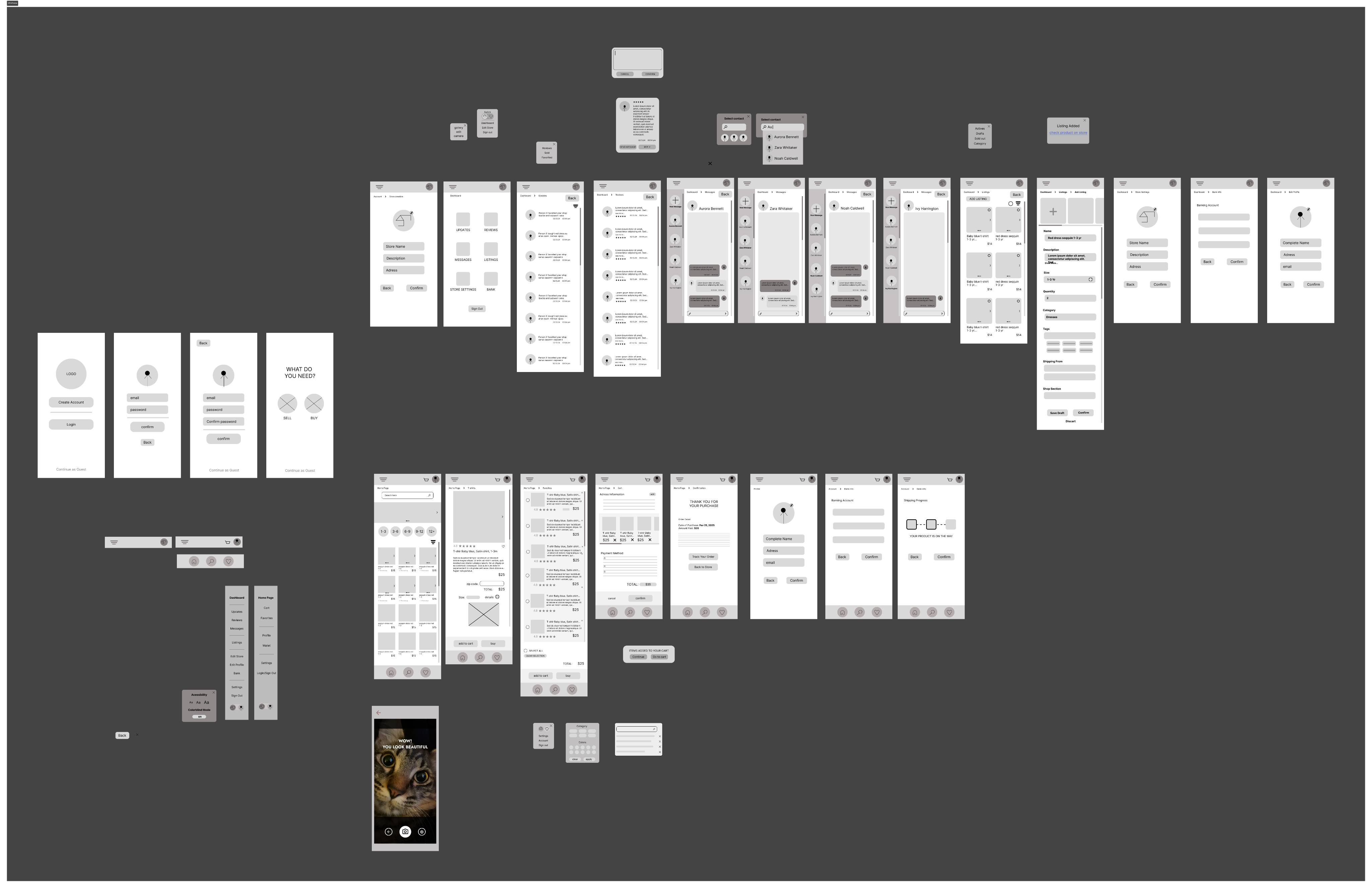
The Information Architecture (IA) for Miniloop underwent a significant transformation as the project evolved. By transitioning from a broad marketplace concept to a specialized seller-focused platform, I was able to create a more streamlined and efficient experience for parents like Isabela.
As I progressed through the design of Miniloop, the project’s scale grew significantly. While my initial goal was to build a complete end-to-end marketplace for both buyers and sellers, the sheer complexity of creating a seamless experience for two distinct audiences became an unexpected challenge.
Section Detail
A Necessary Pivot
To ensure the highest quality for the final product, I made the strategic decision to focus my prototype exclusively on the Seller Experience. This allowed me to dive deeper into solving the specific logistical and emotional burdens faced by parents like Isabela, such as clearing apartment clutter and navigating the "quick turnover" of children's wardrobes.
Designing with the Ecosystem in Mind
Even though the final prototype prioritizes the seller, it was essential to research the entire Miniloop ecosystem to build a better product. Understanding the "other side" of the transaction was not a wasted effort; it was the foundation for the seller's architectural evolution.
My first IA was a balanced, dual-path system. The second iteration (the Sitemap) reflects a strategic concentration on a robust Seller Dashboard, ensuring the operational side of the marketplace is rock-solid before expanding.
Prototypes and Tests
This phase was the turning point of the project, where I transitioned from structural planning to active user validation. By testing the Miniloop ecosystem with real users and seeking expert feedback, I was able to transform a complex marketplace into an intuitive, minimalist experience.
High-Fidelity Prototyping: The Dual Path
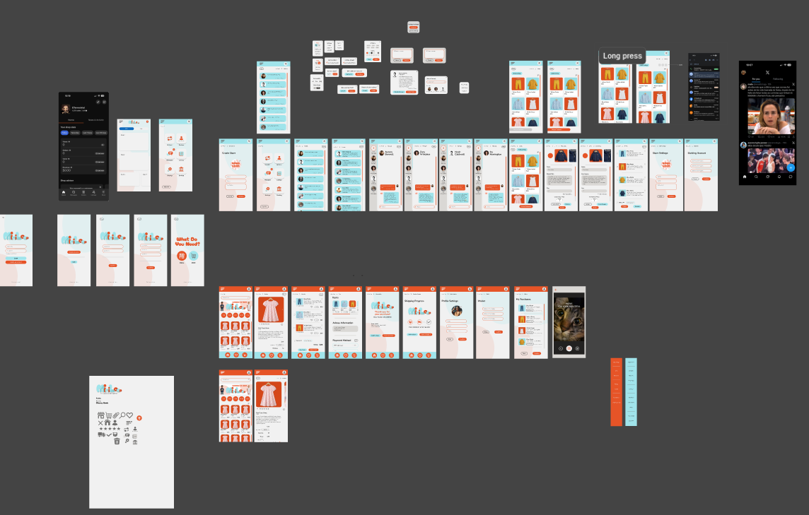
Following the initial tests, I moved into High-Fidelity Prototyping, building out the full visual experience for both the buyer (Ana Paula) and seller (Isabela) paths. This version integrated the aesthetic identity of the brand while ensuring that features like the "Chat Space," "Seller Mode," and "Age/Size Filters" were fully realized to meet the specific needs identified in the Ideation Board.
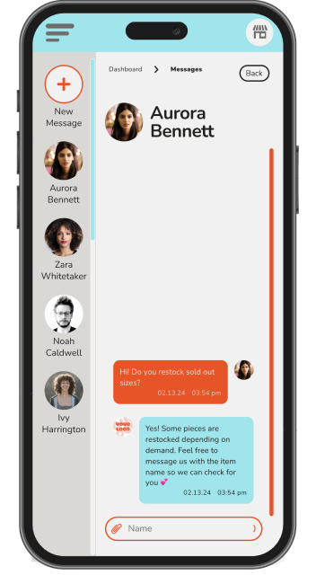
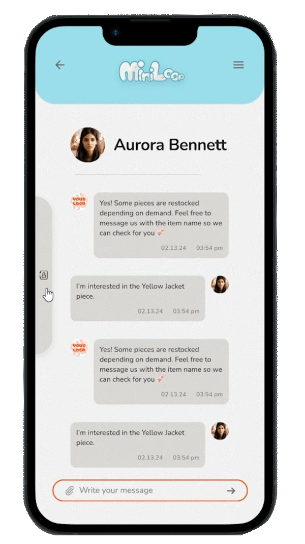
Expert Peer Review & Minimalist Iteration
As I finalized the high-fidelity designs, I consulted with an experienced UX designer for a professional peer review. This collaboration provided invaluable insights that went beyond standard user testing.
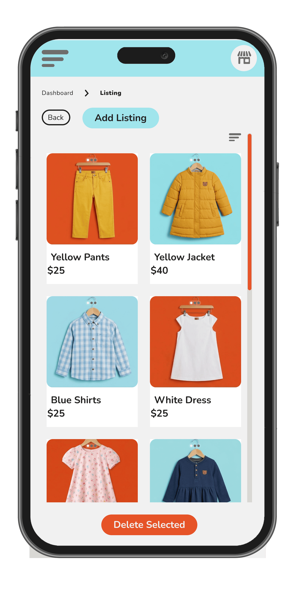
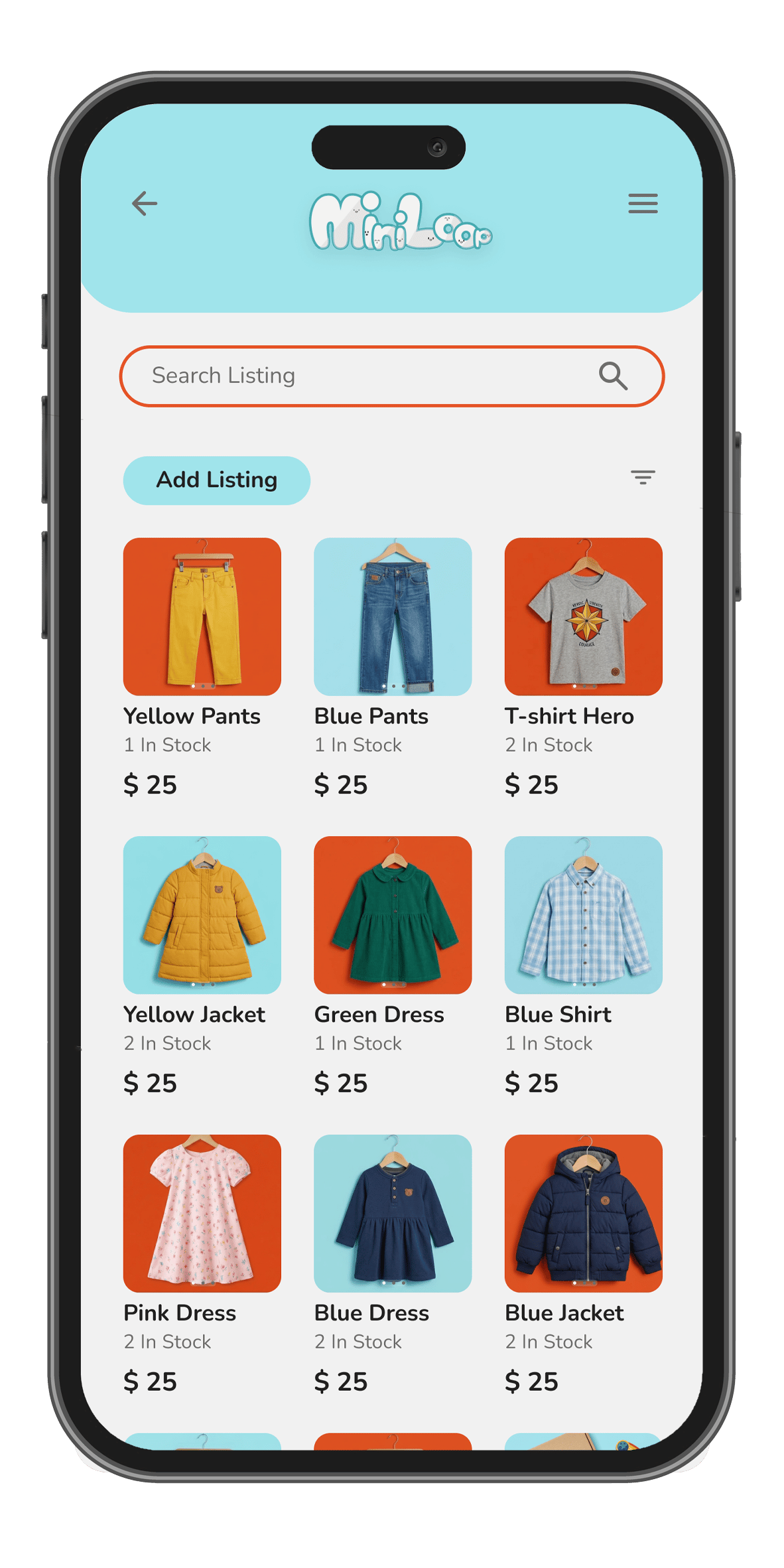
The Outcome: Based on this feedback, I shifted toward a more minimalist approach. I simplified the visual hierarchy and reduced the cognitive load, ensuring busy parents could navigate the app with total ease and clarity.
Examples:
Final Product
With the core functionality validated through usability testing, I moved into the final design phase. This stage focused on creating a cohesive visual language that balances the playfulness of a children's brand with the reliability of a secure marketplace.
Design System
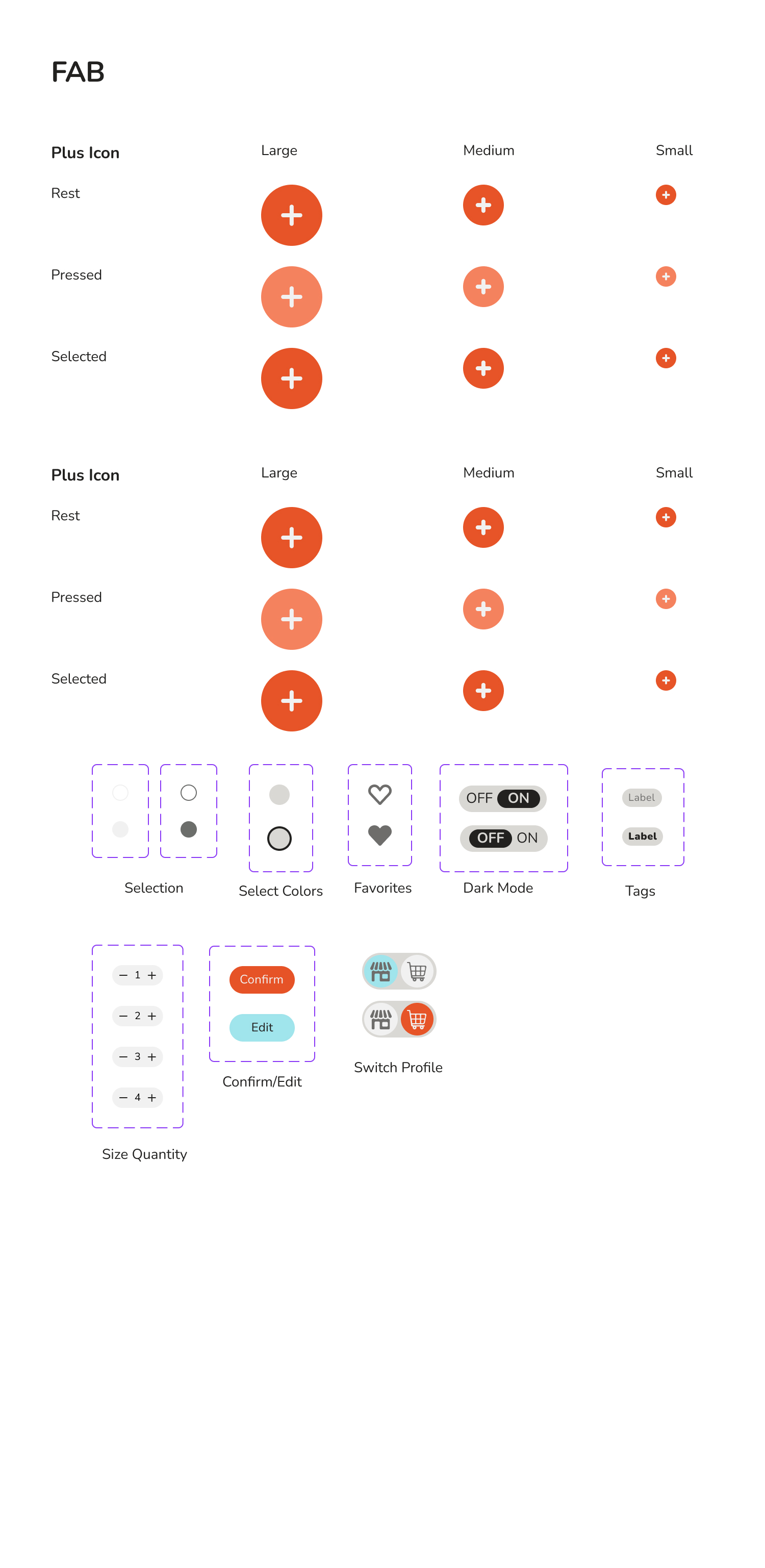
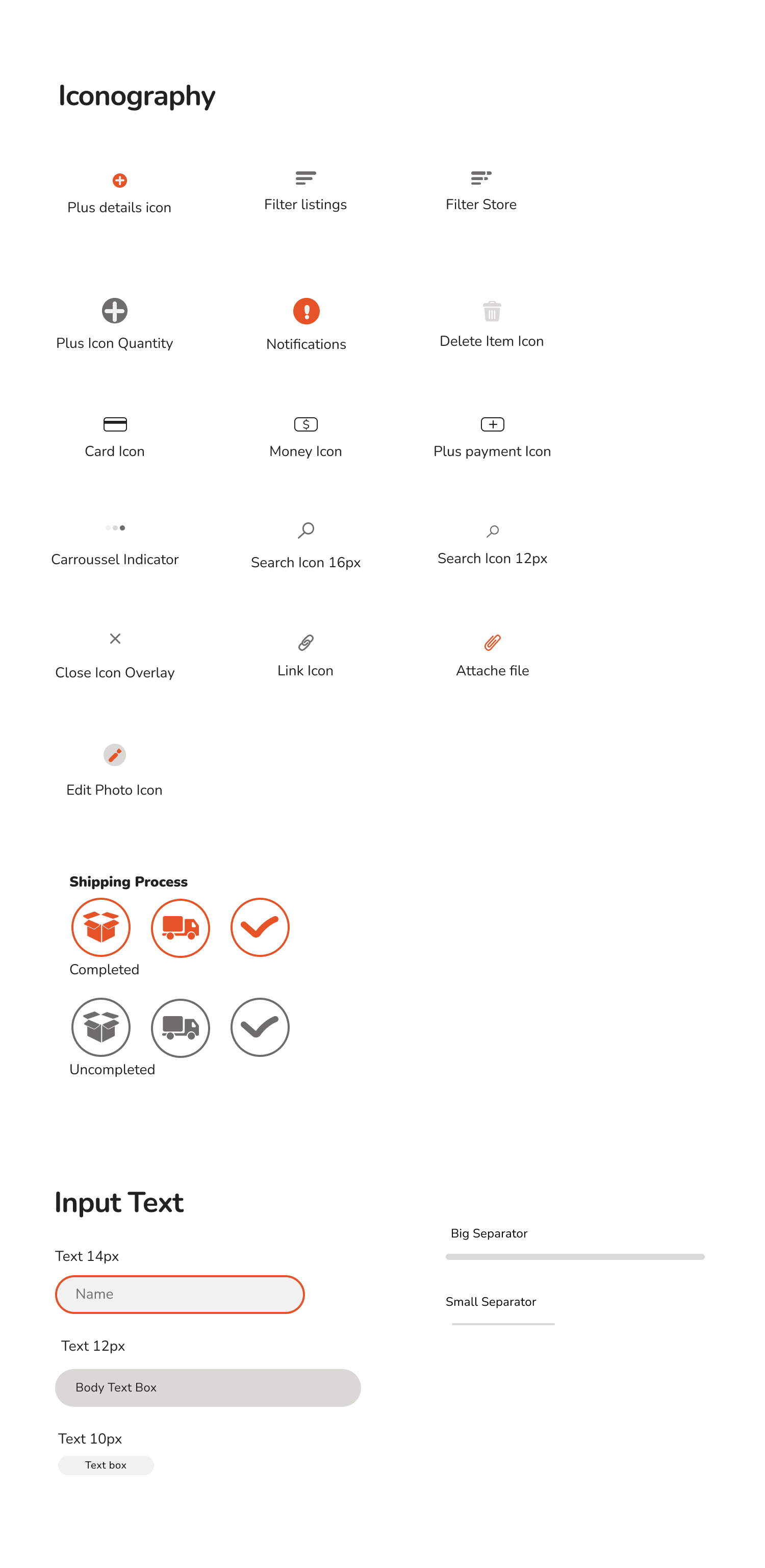
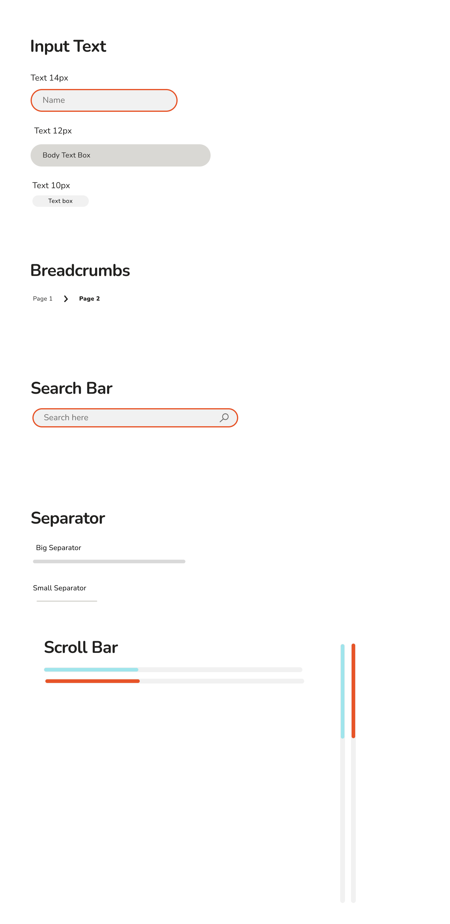
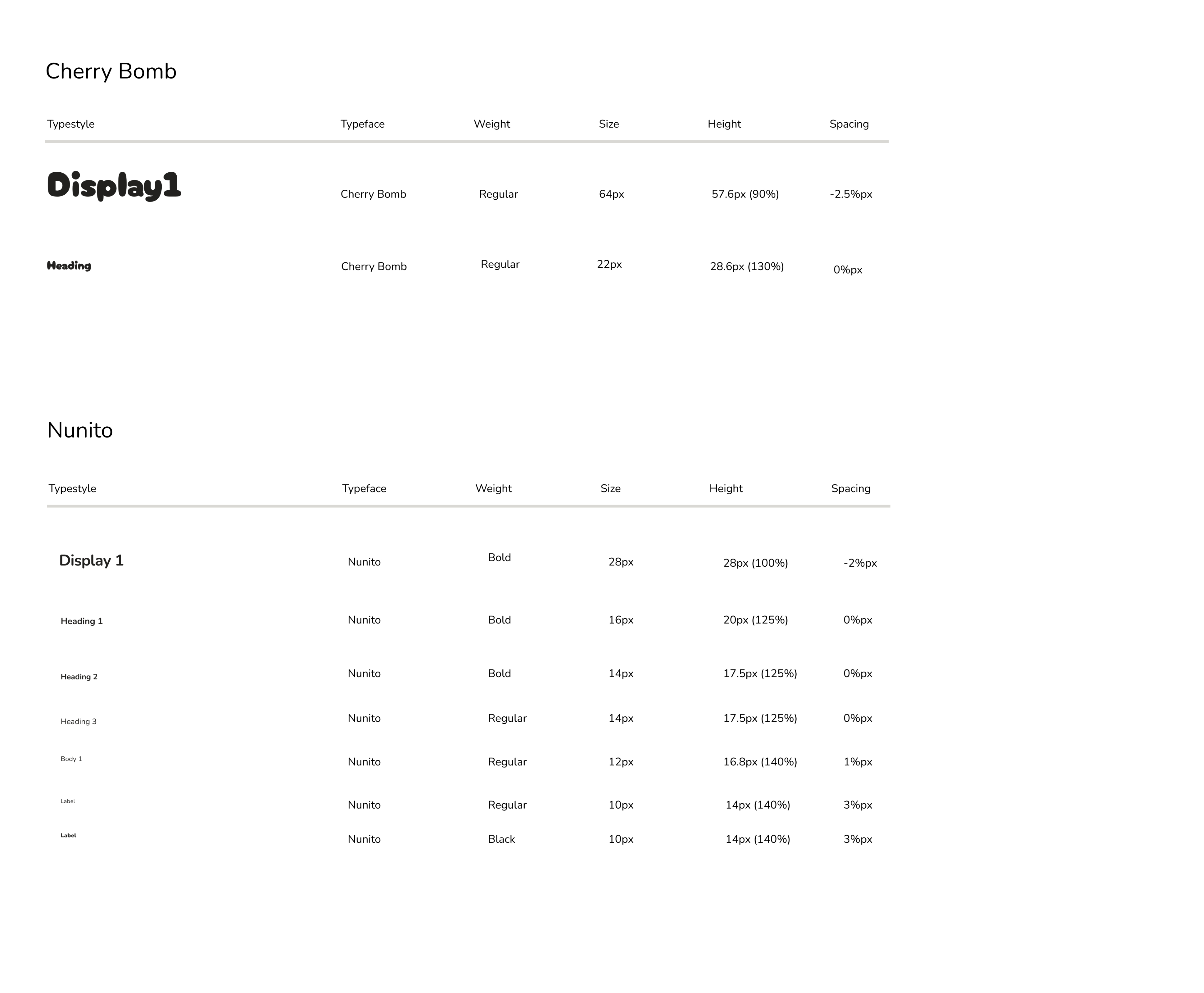
Style Guide: The Visual Foundation
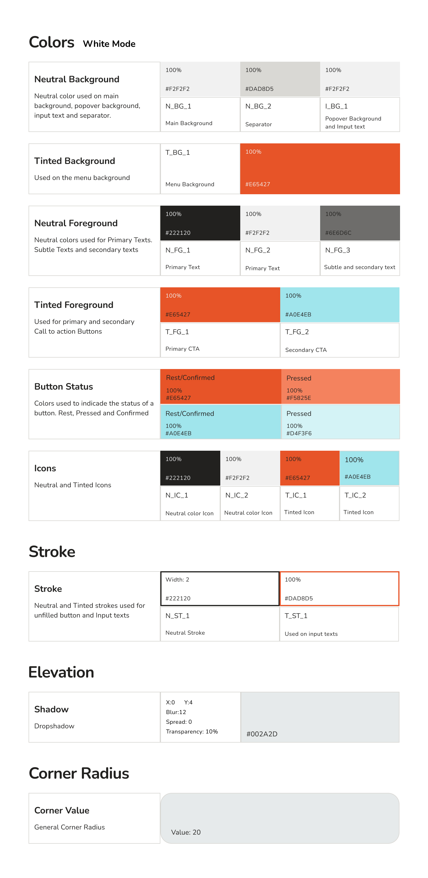
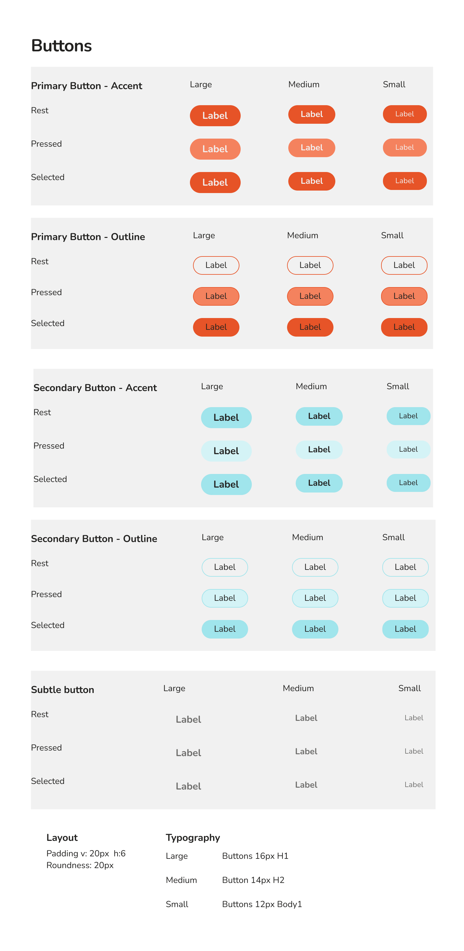
To ensure consistency and accessibility across the entire platform, I developed a comprehensive Style Guide. This system was designed to reduce cognitive load while providing a vibrant, user-friendly atmosphere.
- Color Palette: I utilized a high-contrast palette featuring Action Orange for primary calls-to-action and Secondary Teal for secondary elements. This combination ensures that interactive elements are immediately recognizable for busy parents on the go.
- Typography: The brand uses a dual-font system to balance character with readability. Cherry Bomb is used for bold, playful headings, while Nunito provides a clean, professional look for body text and labels, ensuring high legibility across all screen sizes.
- Design System Components: I created a library of reusable components, including Standardized Buttons (with distinct states for rest, hover, and press), Custom Iconography for shipping and categories, and Consistent Input Fields to streamline the listing process.
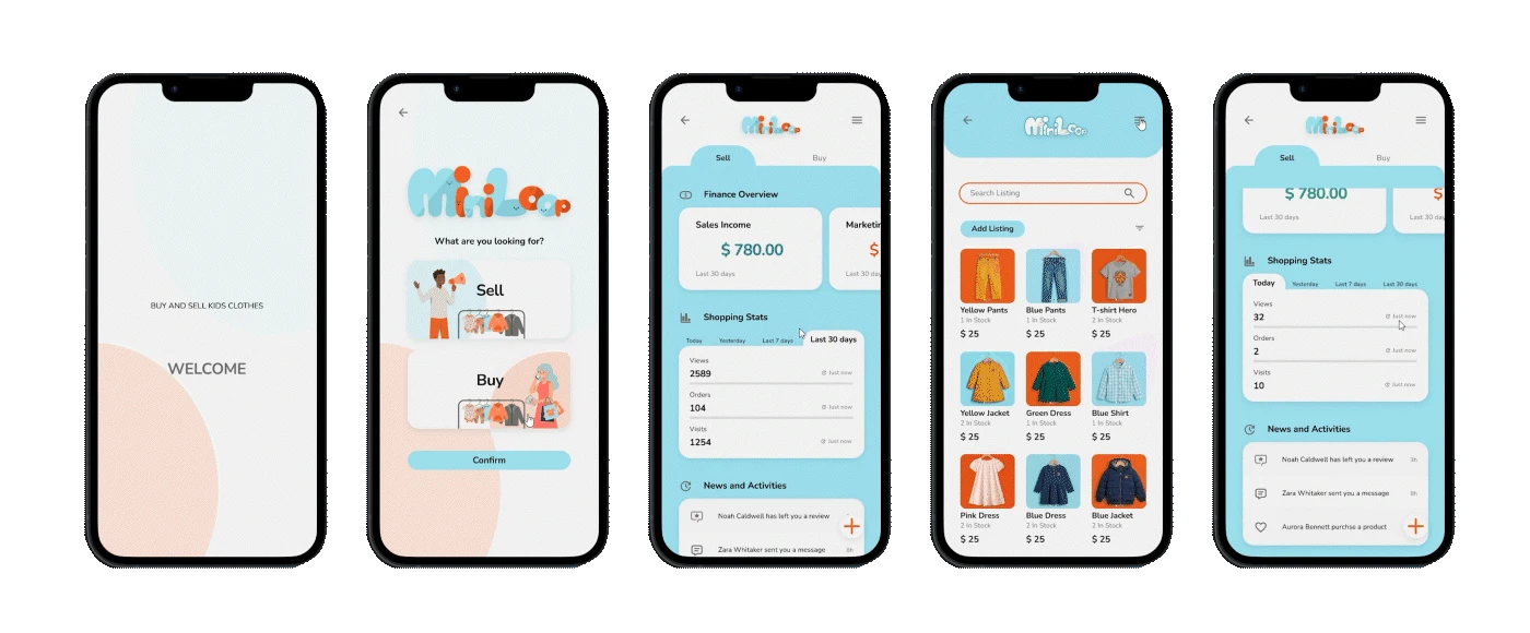
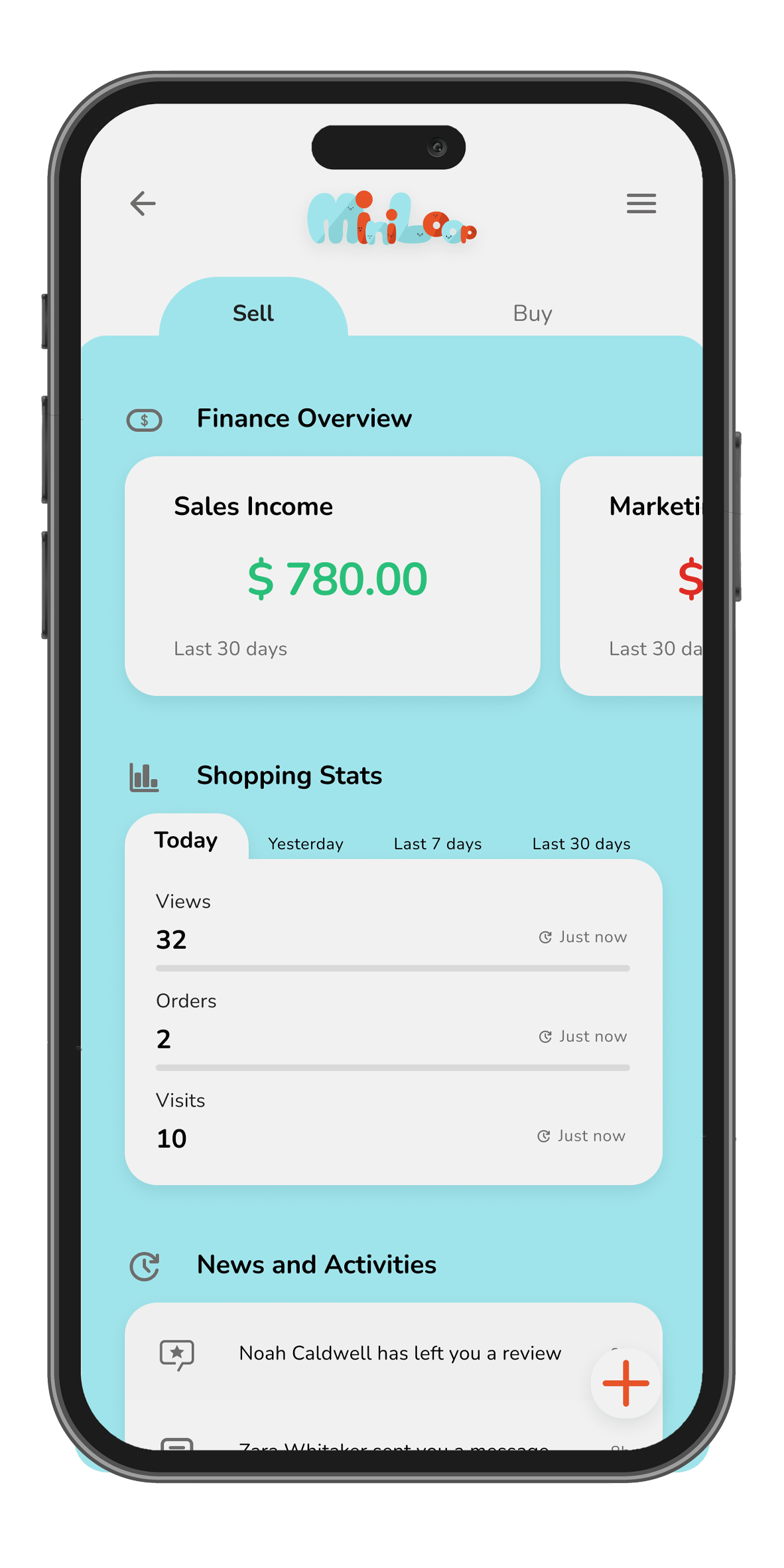
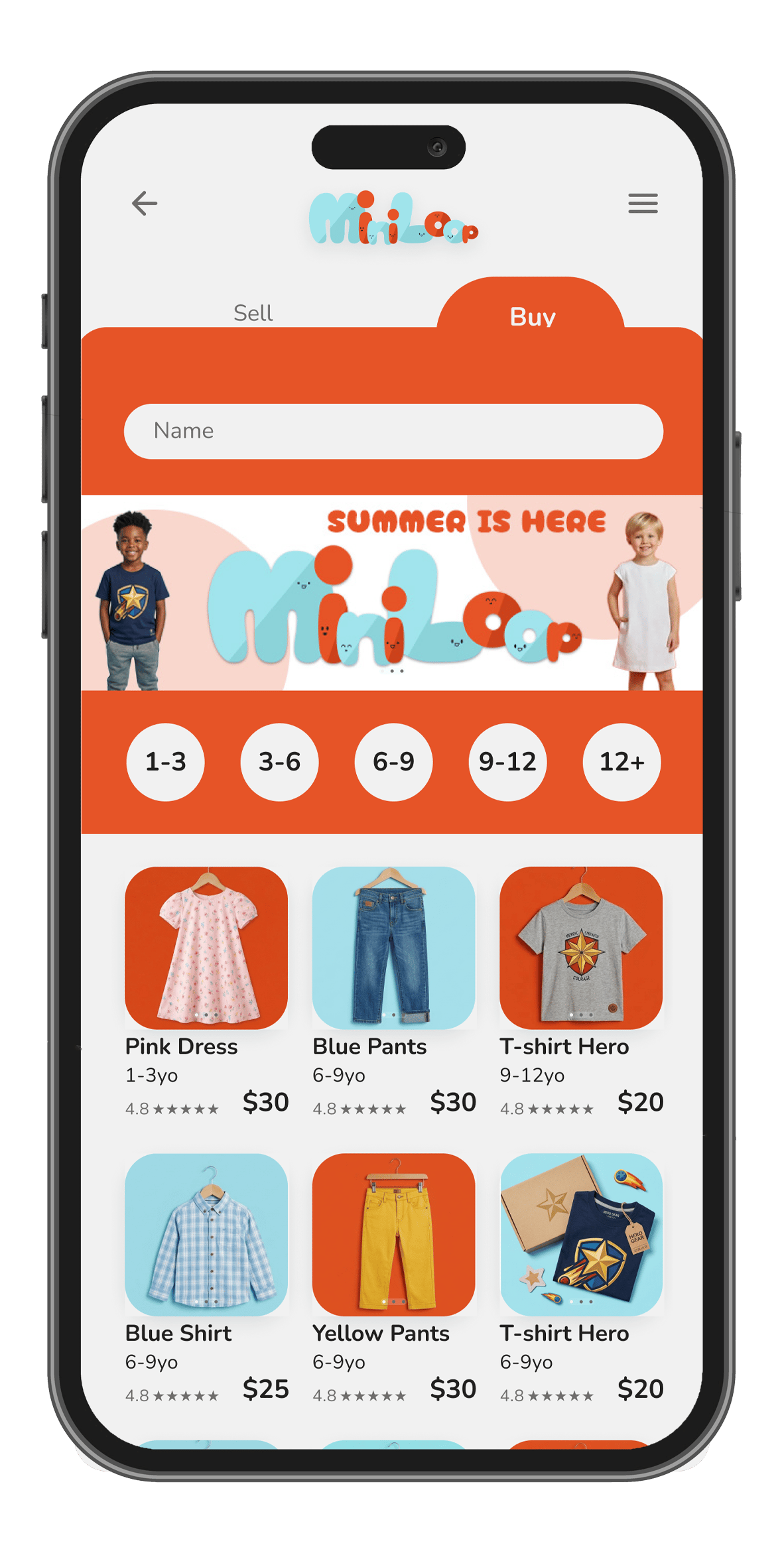
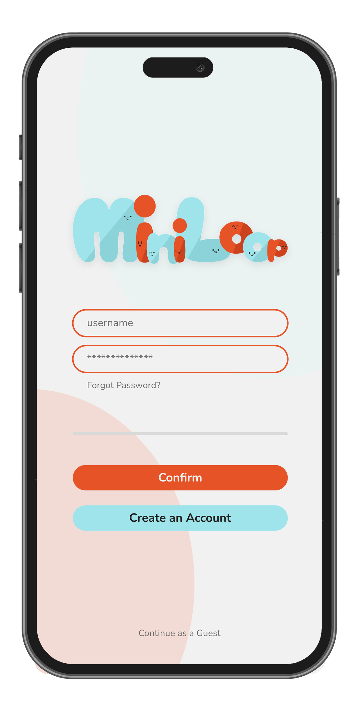
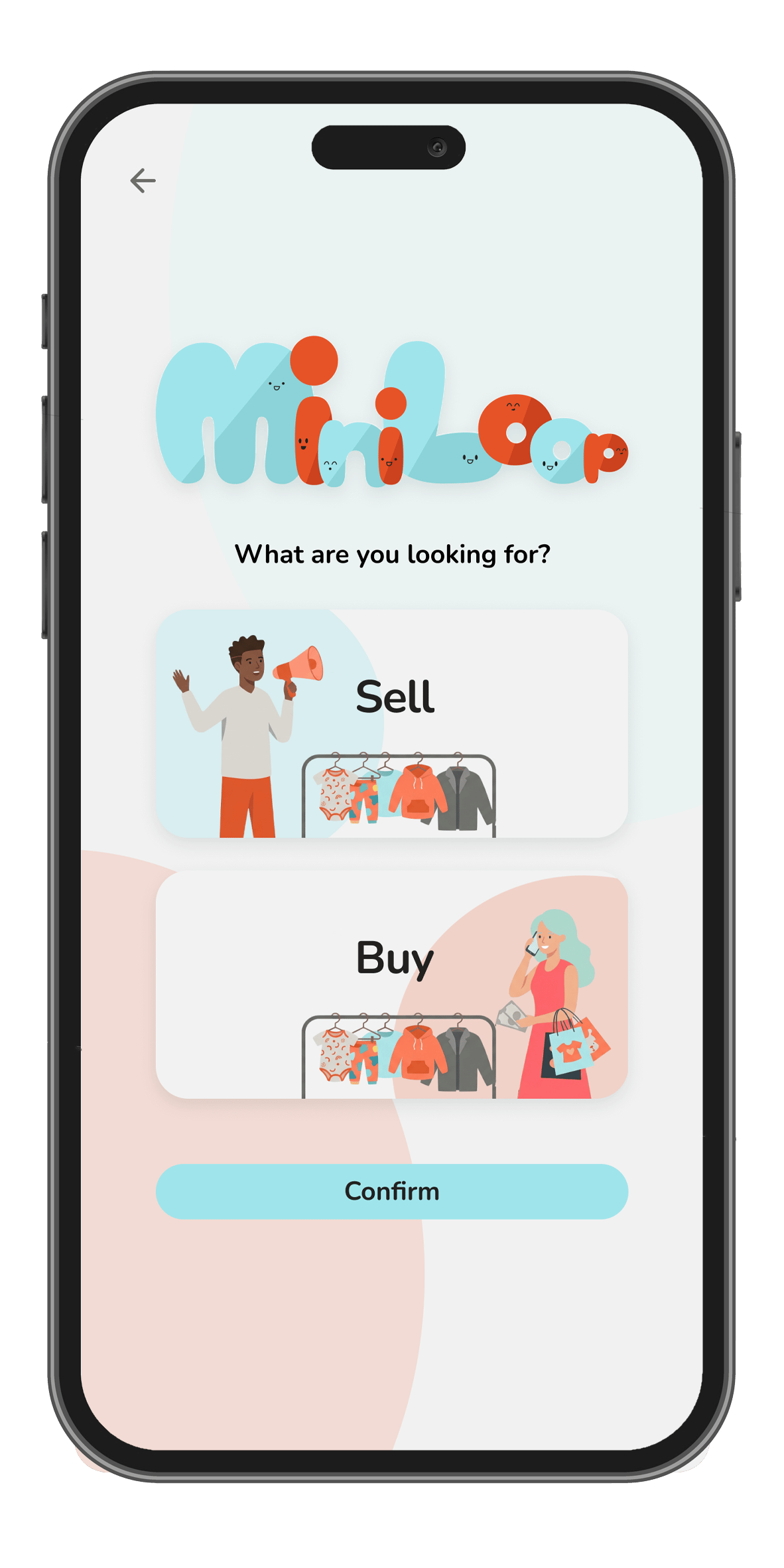
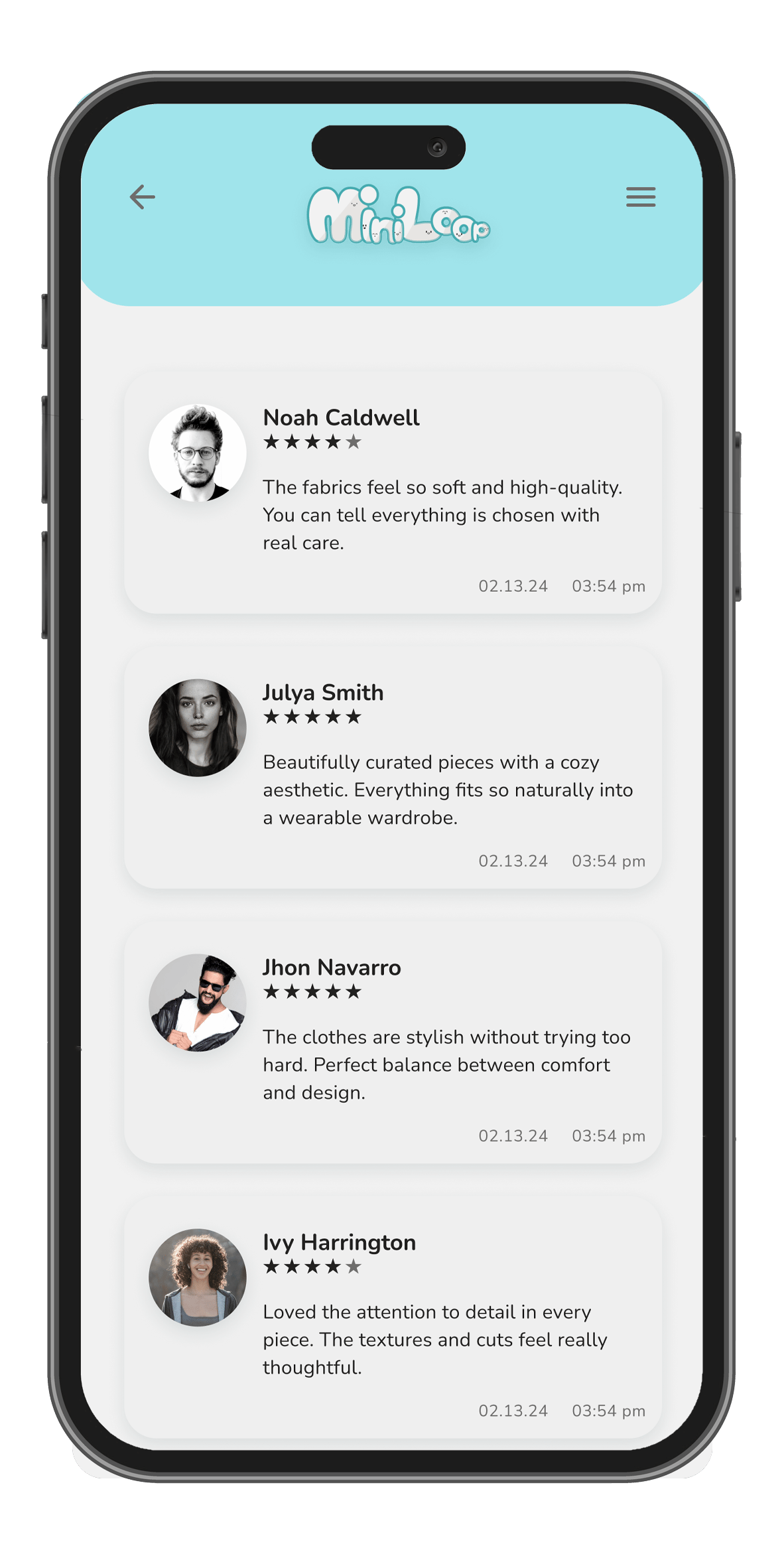
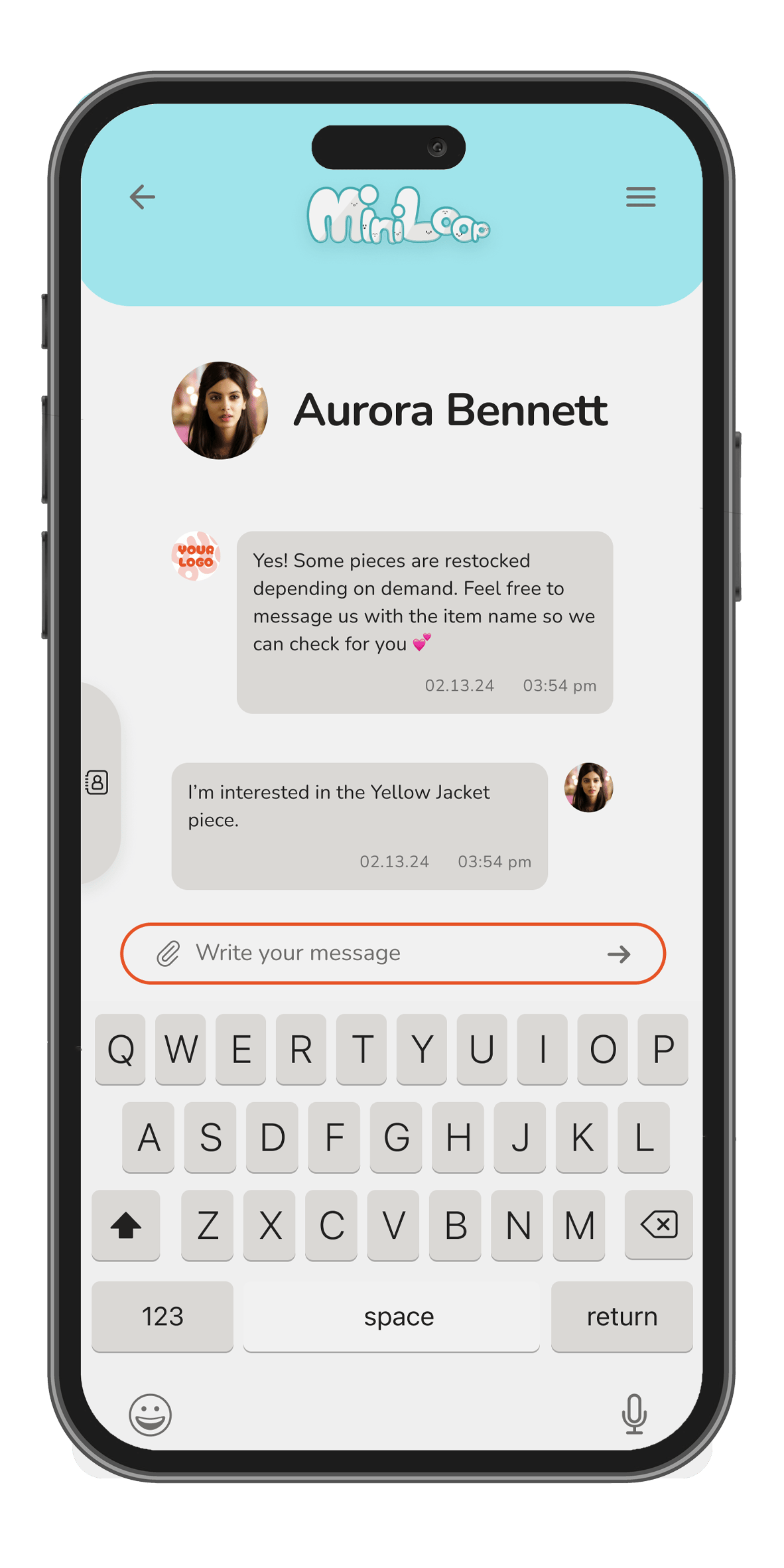
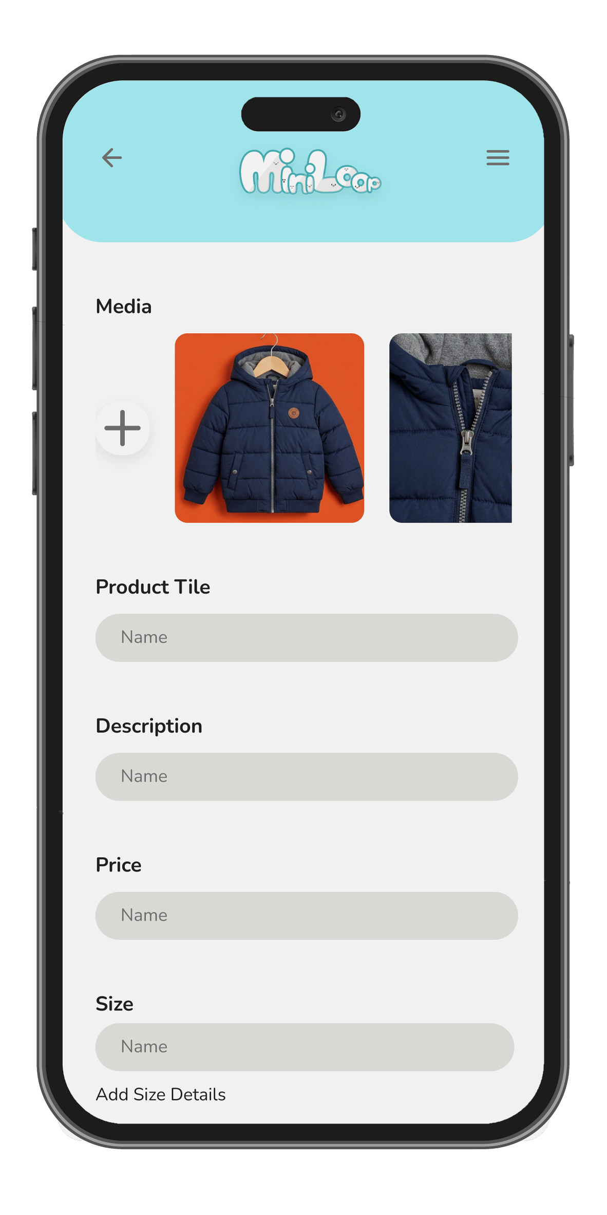
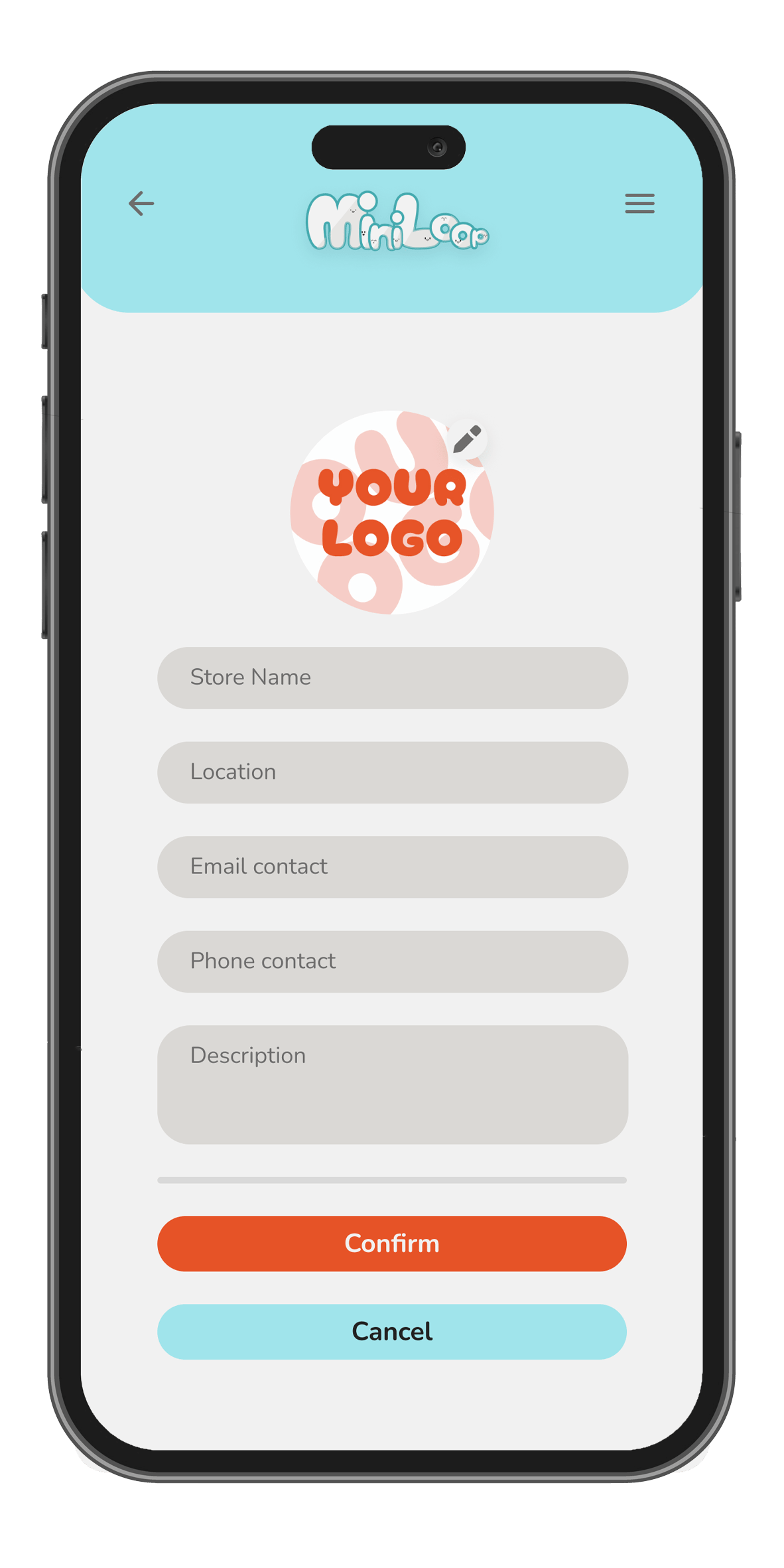
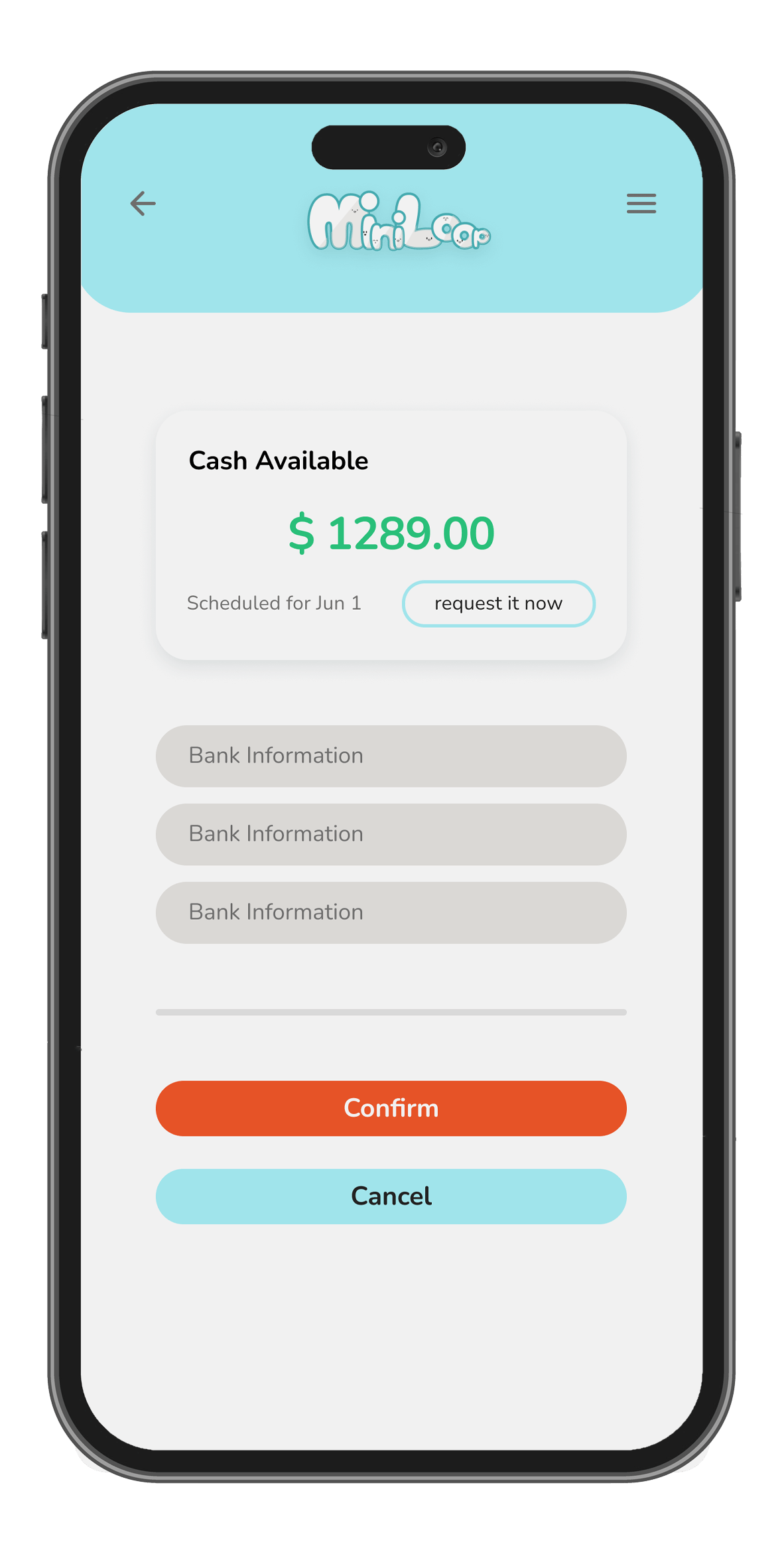
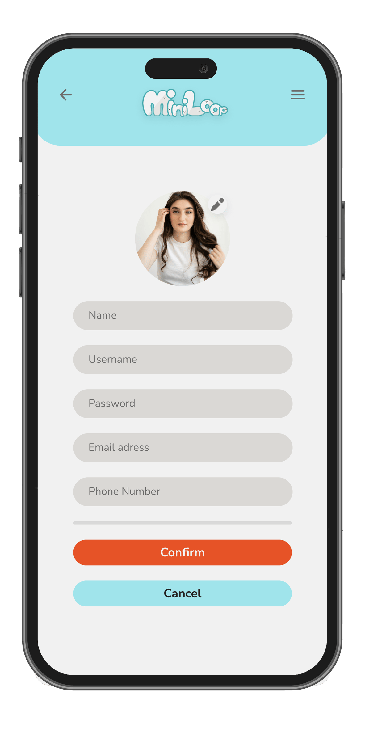
Miniloop High-Fidelity Prototype
The final high-fidelity prototype represents the complete Miniloop ecosystem. It bridges the gap between the seller’s need for efficient decluttering and the buyer's need for quality and trust.
Responsive Design: The Desktop Experience
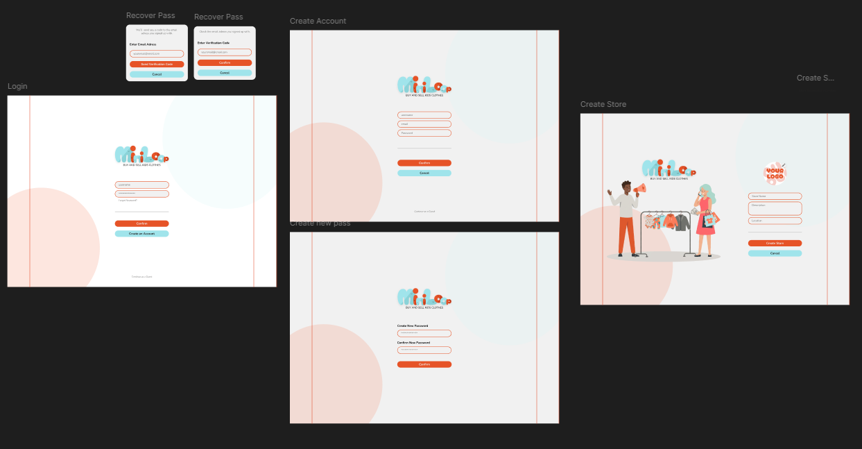
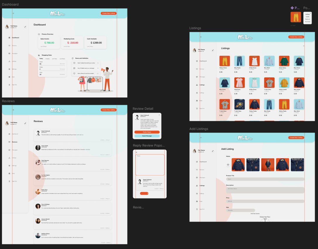
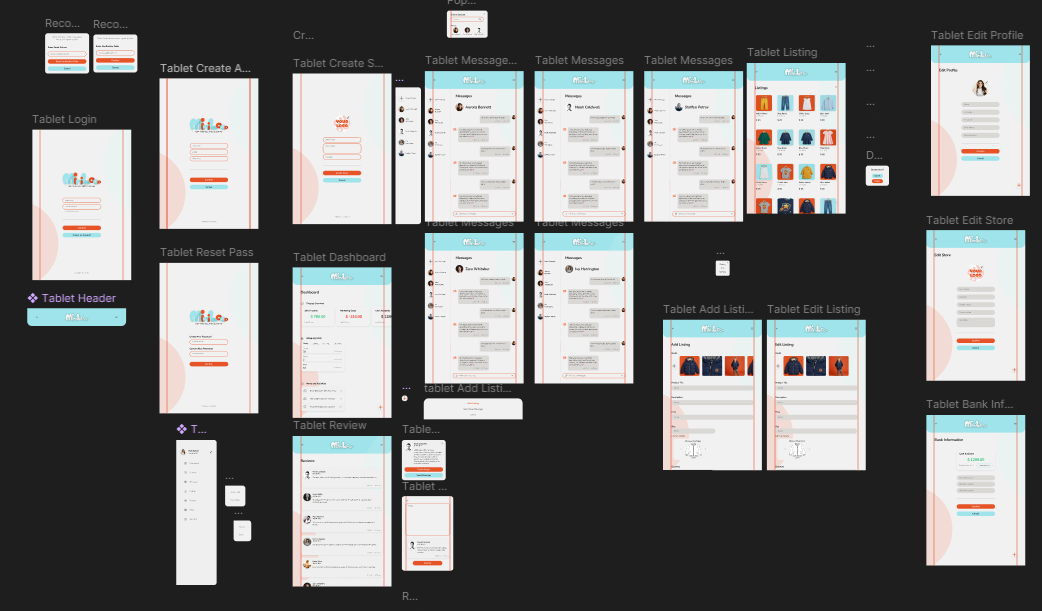
While Miniloop is a mobile-first platform to accommodate the active lifestyles of parents, I also developed a brief Desktop Version to ensure a seamless cross-device experience.
Responsive Website Version
- Responsive Adaptation: The desktop interface utilizes the extra screen real estate to provide an expanded Seller Management Console, allowing users to manage high-volume listings and detailed store analytics with greater ease.
Future Roadmap
While the current version of Miniloop provides a robust and deeply researched solution for the primary seller experience, I recognize that a truly successful e-commerce ecosystem requires a holistic approach. If I were to continue developing this product, the next phase would involve things like:
- Complete Buying Path: Fully integrate the high-fidelity journey for buyers like Ana Paula, incorporating features like accurate sizing guides (e.g., measurements in cm), quality assurance indicators, and high-utility filters for age, color, and style.
- Logistics & Transparency: Develop dedicated Shipping Pages that offer real-time order tracking and status updates. This addresses the "impatience" and "caution" identified in user journey research for both sellers and buyers.
- Enhanced Reliability: Implement a Community Space for parent-to-parent advice and refined Payment Options to build trust and increase conversion rates.
- Full Desktop Parity: Expand the current mobile-first design into a comprehensive desktop version, ensuring users can manage their stores and purchases seamlessly across all devices.
Learnings & Takeaways
Completing the Miniloop project was a transformative experience in my journey as a UX designer. As a student project, it provided a comprehensive look at the end-to-end design process, teaching me that great design is not just about aesthetics, but about deep user empathy and strategic prioritization.
User-Centered Discovery & Overcoming Bias
One of my most significant realizations was how easily personal bias can interfere with design decisions. Initially, I had assumptions about how a marketplace should function, but the Usability Testing phase was eye-opening. By interviewing four participants and observing their real-time interactions, I learned that what I found intuitive was not always clear to the user. This reinforced the absolute necessity of user interviews to uncover real needs and pain points, such as the "overwhelmed" feeling parents experience during complex listing processes.
Strategic Focus & Project Management
This project taught me a valuable lesson in scope management and the reality of design timelines. As I mapped the full ecosystem for both buyers (Ana Paula) and sellers (Isabela), I realized the immense scale of building a two-sided marketplace.
- The Pivot: I learned that focusing on one core problem allowed for a higher-quality, more impactful solution than a superficial attempt at everything.
- Continuous Evolution: I now understand that a product is never truly "finished." The Future Roadmap I developed taught me how products must evolve over time, adding features like order tracking and a full buying path as the ecosystem grows.
My First Design System
Building my first-ever Design System was a highlight of this project. Creating a library of colors, typography, and reusable components was a lesson in both efficiency and craft. Once the system was established, building new screens became significantly faster and more intuitive. Also the system ensured that every interaction, from button states to iconography, felt like a cohesive part of the Miniloop brand, providing a professional and trustworthy experience for the user.
The Impact of Feedback
Finally, I learned the immense value of seeking and incorporating feedback. Whether it was the quantitative data from KPIs (Time on Task, Error Rates) or the qualitative insights from an expert peer review, every piece of feedback was a catalyst for improvement. These insights led to a more minimalist approach, reducing cognitive load for busy parents and ensuring the final app was truly intuitive and user-friendly.